Idea
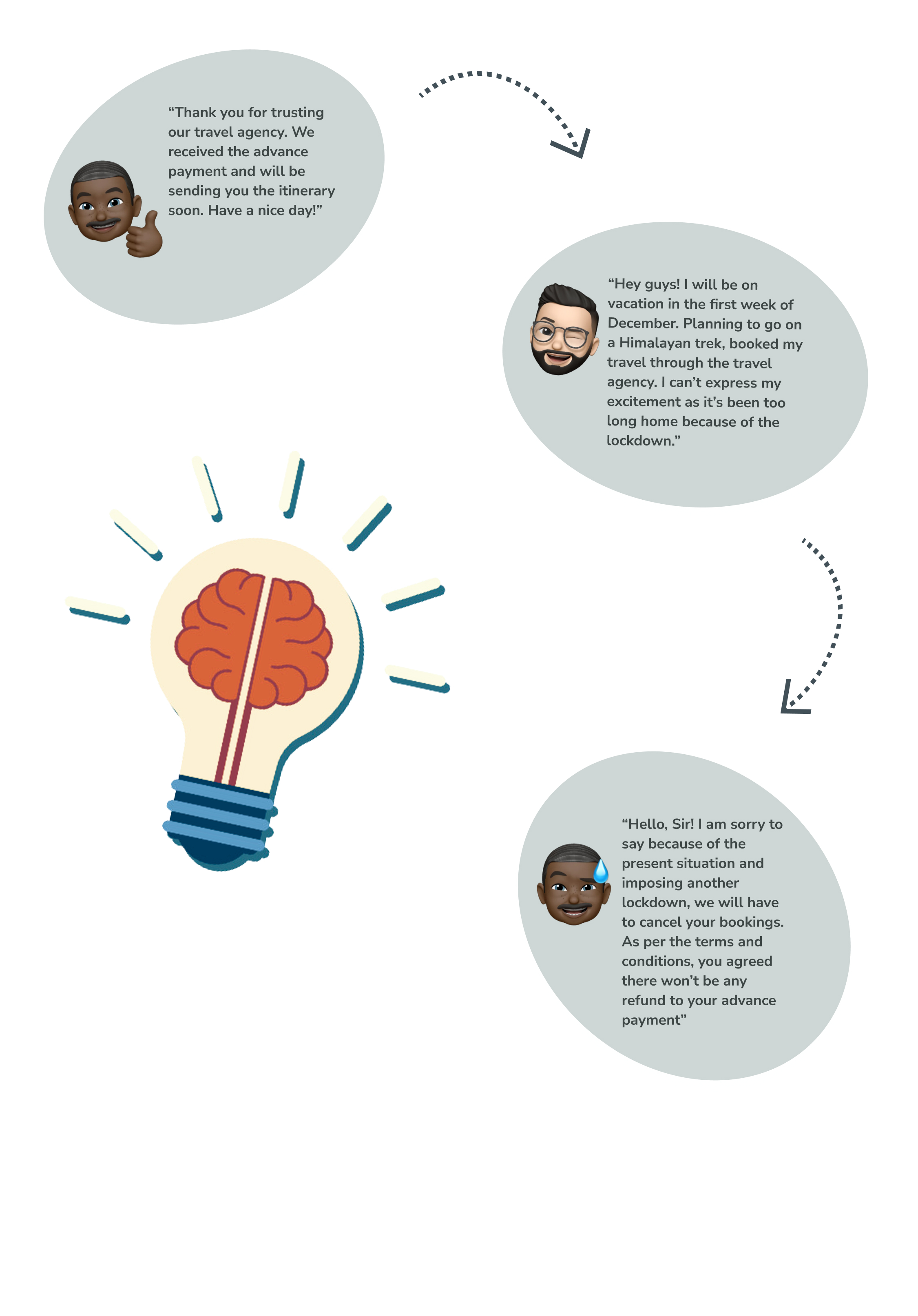
I stumbled upon this idea after getting to know about an incident faced by one of my friends. My friend had planned a trip to escape from what seems never-ending work from home life. He had booked his tour through a travel agency which charged him a certain amount upfront as an advance payment for booking & scheduling his tour. My friend’s excitement was evident when he showed me the brochure and itinerary of his trip. Within a week, due to the speedy rise in the number of covid positive cases, the government imposed restrictions on travelling. As per the terms and conditions, the travel agency denied my friend’s request for a refund of the advance he paid. This incident made me question our dependence on travel agencies for travelling anywhere.
My Role:
UX Designer
UI Designer
Who?
For travel lovers, explorers, bikers, hikers etc. This app could be used by anyone above the age of 13 years.
What?
With this app users could:
Create and set up their profiles, where they can upload and add their travel experiences and happy moments.
Search travel destinations based on the activity they wish to do.
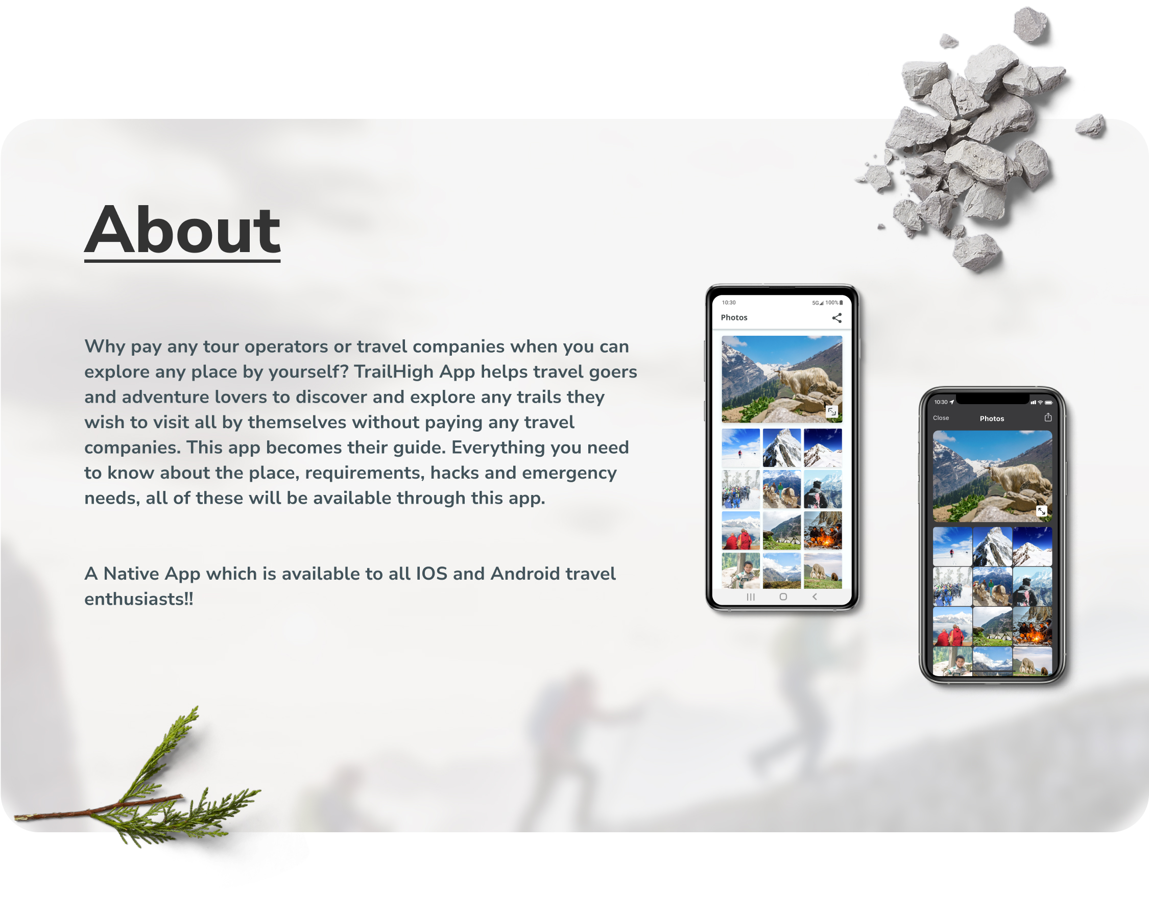
Find more about any destinations with available information about the place, images, maps, travel hacks and requirements.
Can save any liked or interesting destinations to the bucket list.
Could travel better with the help of navigations.
Where?
This app could be used anywhere like, at your home, for deciding your next travel destination or within a dense forest or on the highest mountain peaks to find your way to your destination.
When?
This app could be used by users whenever he/she wishes to.
Why?
This app is free to use and would easily connect to a wide range of audiences. There is no second or third party involved to user’s plans and all exploration could be done by himself/herself without having to be dependent.
User Stories
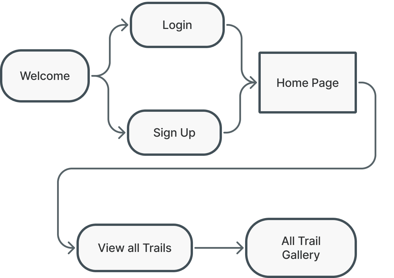
When I log into the app, I want to see all the available trails, so that I can see and select any one trail and explore it myself.
SUCCESS CRITERIA: Successful logging in and Viewing all the available Trail.
Welcome
Login
Home Page
View all Trails
All Trail Gallery
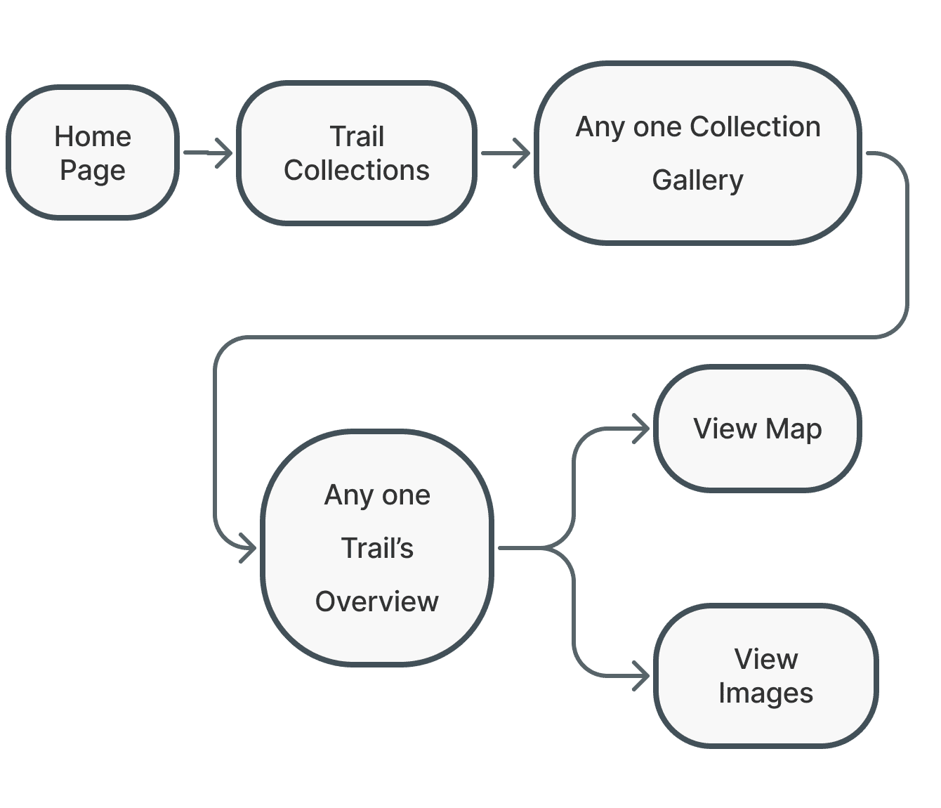
When I select any one trail from any specific region’s trail I want to see the images & the maps of that trail , so that I can know more about it and plan accordingly.
SUCCESS CRITERIA: Image Gallery and Topographic map of the trail
Home Page
Trek Collections
Any one Collection Gallery
Selected Trek’s overview
View Map or View Trail Images
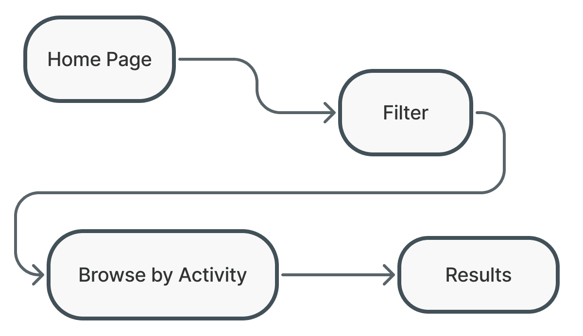
When I wish to do an activity such as mountain biking or skiing, I want to view all trail destinations where I can enjoy my activity, so that I don’t waste my time searching elsewhere.
SUCCESS CRITERIA: Finding trails according to activity after applying the filters.
Home Page
Filter
Browse by Activity
Results Page
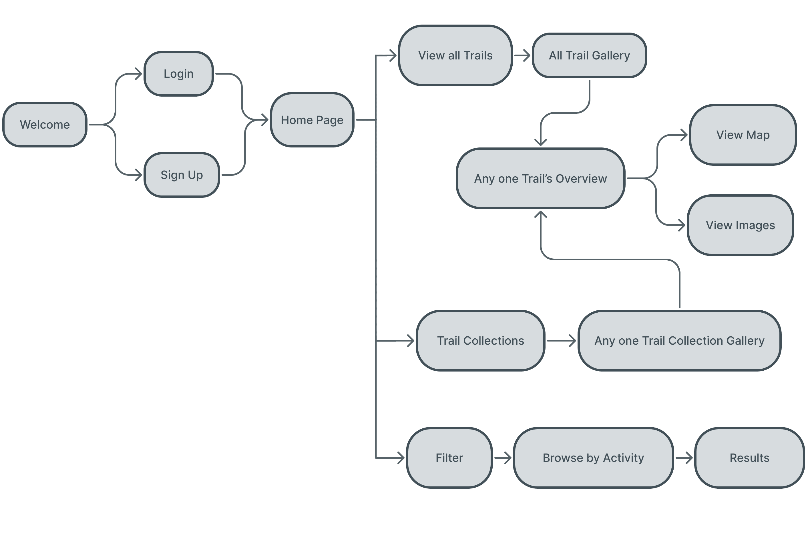
User Flow
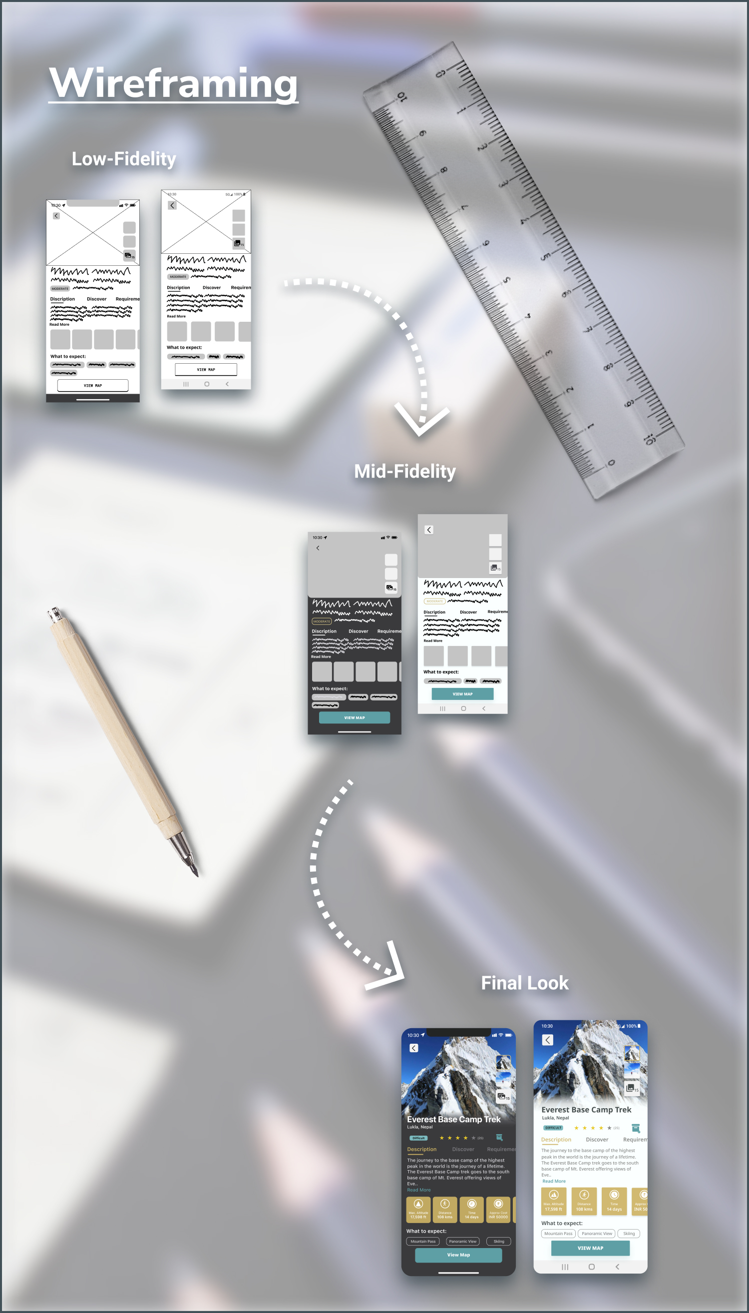
Testing and Iterating
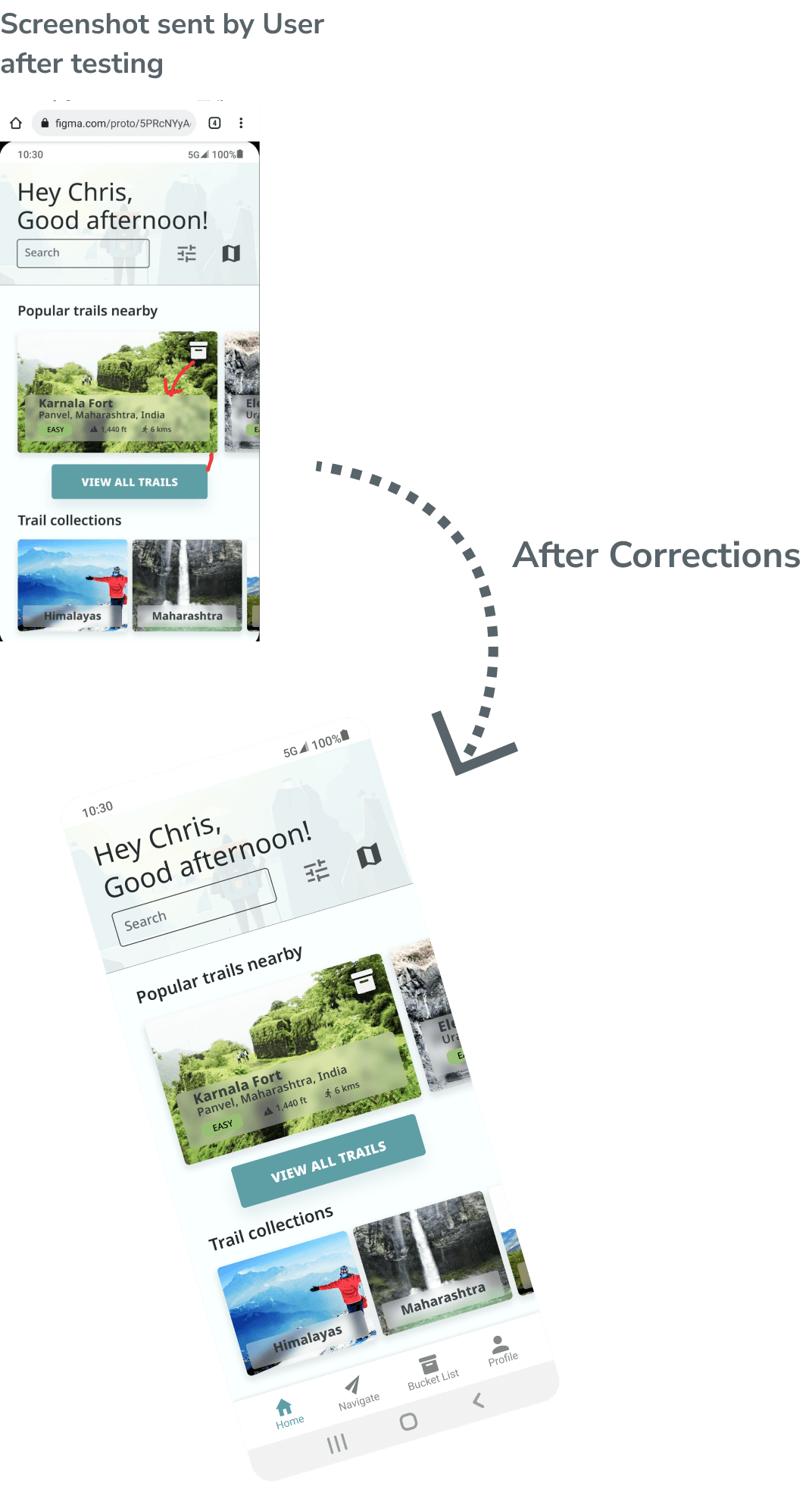
Android User
“ These are my initial thoughts:
'Good Afternoon' is way too big...I prefer the app to have more room for my important content.
‘Search’ placeholder inside the box is placed unevenly from the top and bottom of the box (you can ignore this if such intricacies don’t matter).
It would be nice if you increase the opacity of blurred description cards to make the texts and details visible because more than the images, this info is more important.”
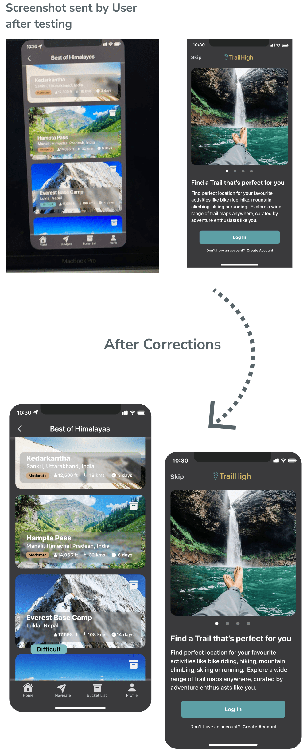
iOS User
“This is what I think;
The images are great, very captivating and High resolution.
I like the Blue and Yellow combination of the menu bars and buttons.
It would be nice if you could make the name plate slightly transparent because the blurred gray background looks off with the gray app background.
Just one last thing. This opening sentence isn’t grammatical. Some places you’ve used present continuous and some simple present: ‘Like bike ride, hike, Mountain climbing, skiing..’
Make it all -ing words.”

Native App
This app was designed for all users irrespective of what kind of phone they own. To make this available to everyone, it was designed according to two major native mobile platforms; iOS and Android.
The app was created with complete adherence to guidelines provided by each platforms.
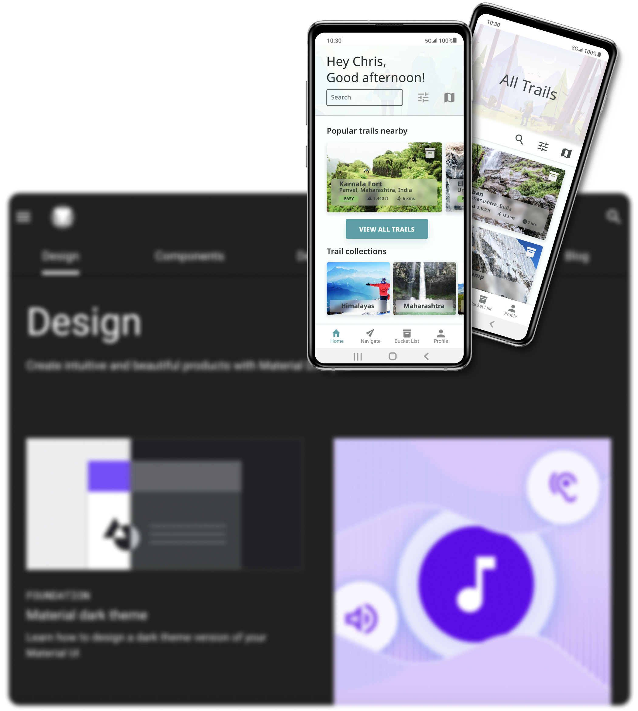
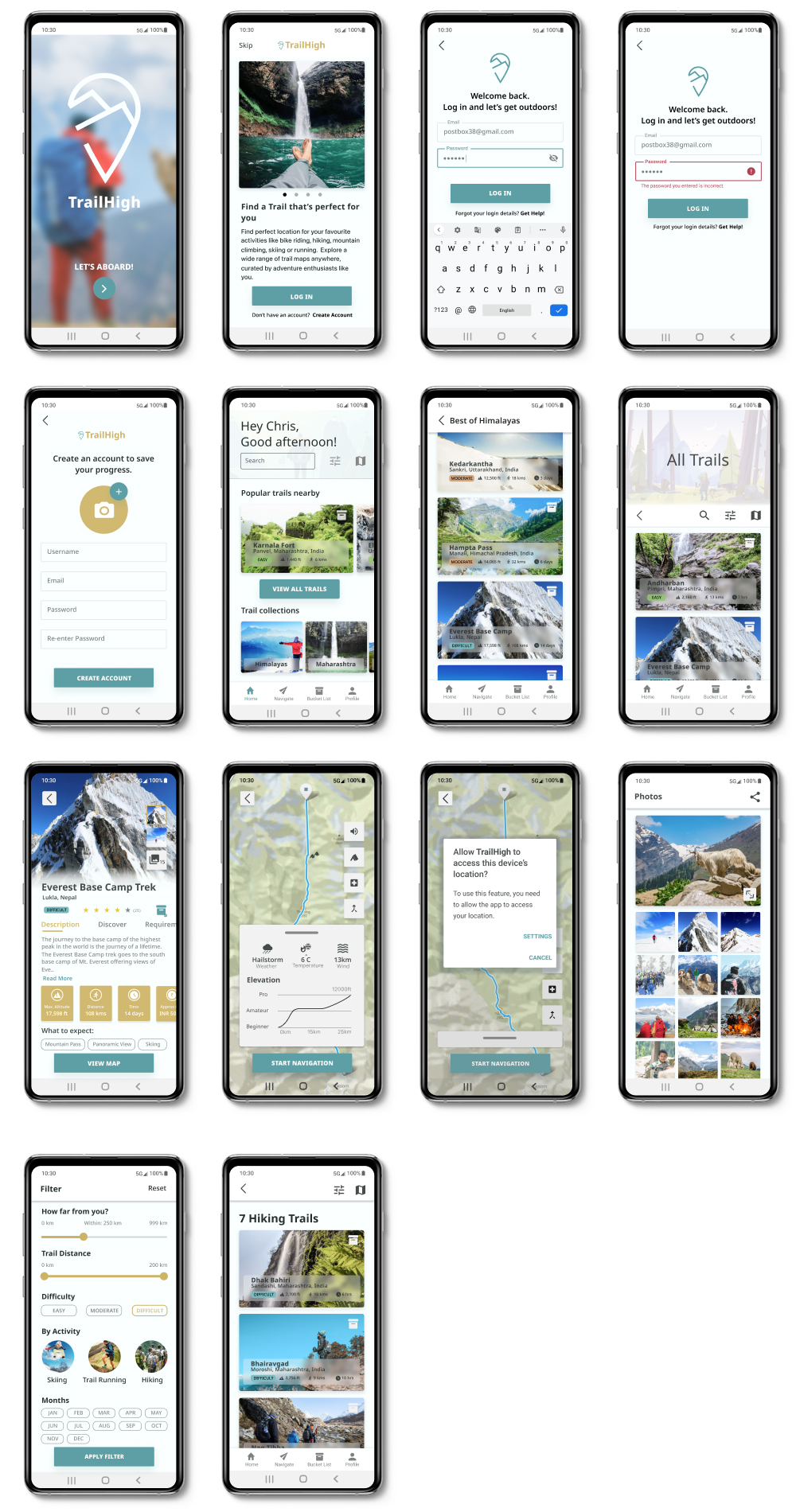
Android
Android version of the app was designed with the help of Material Design Guidelines.
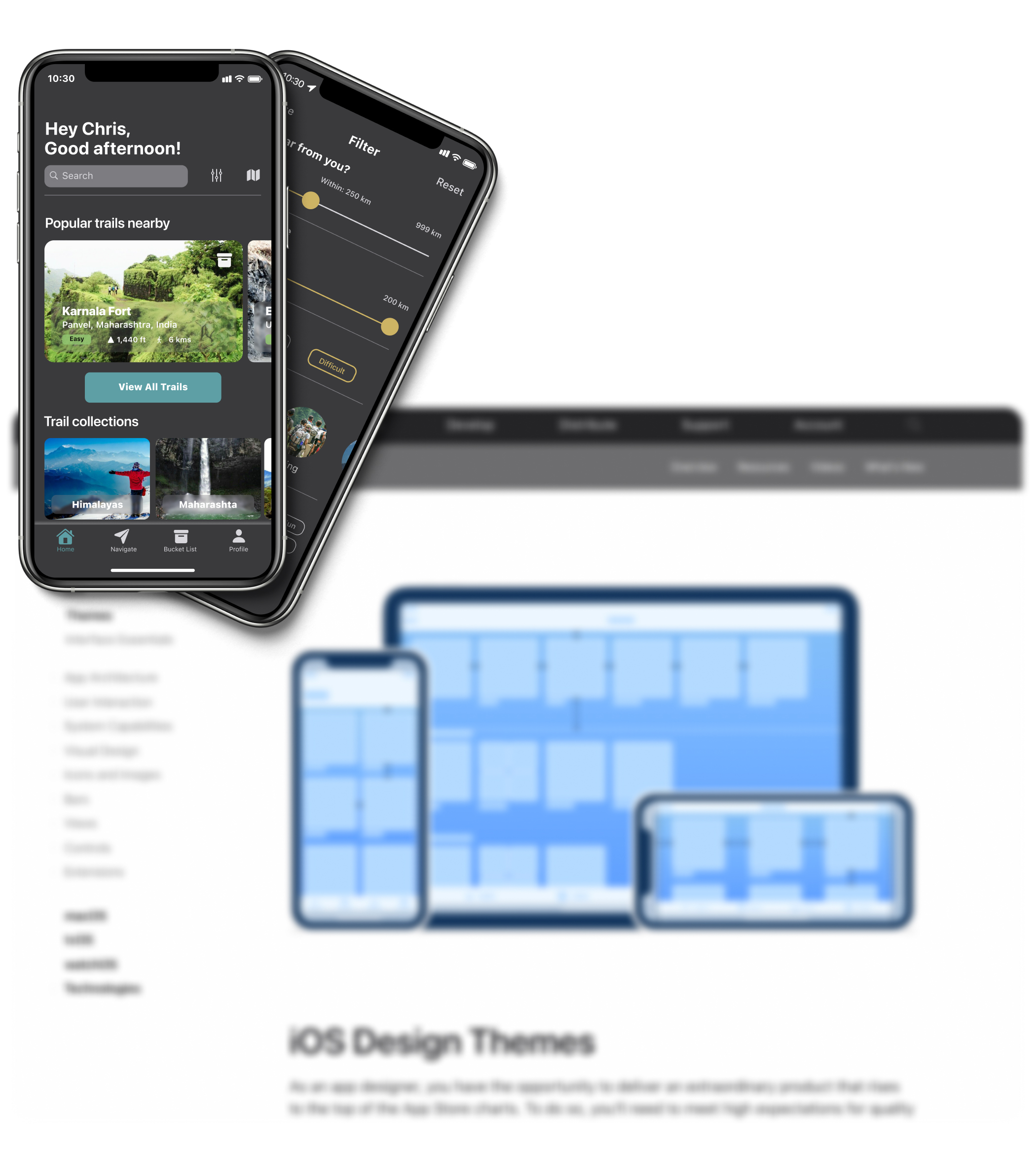
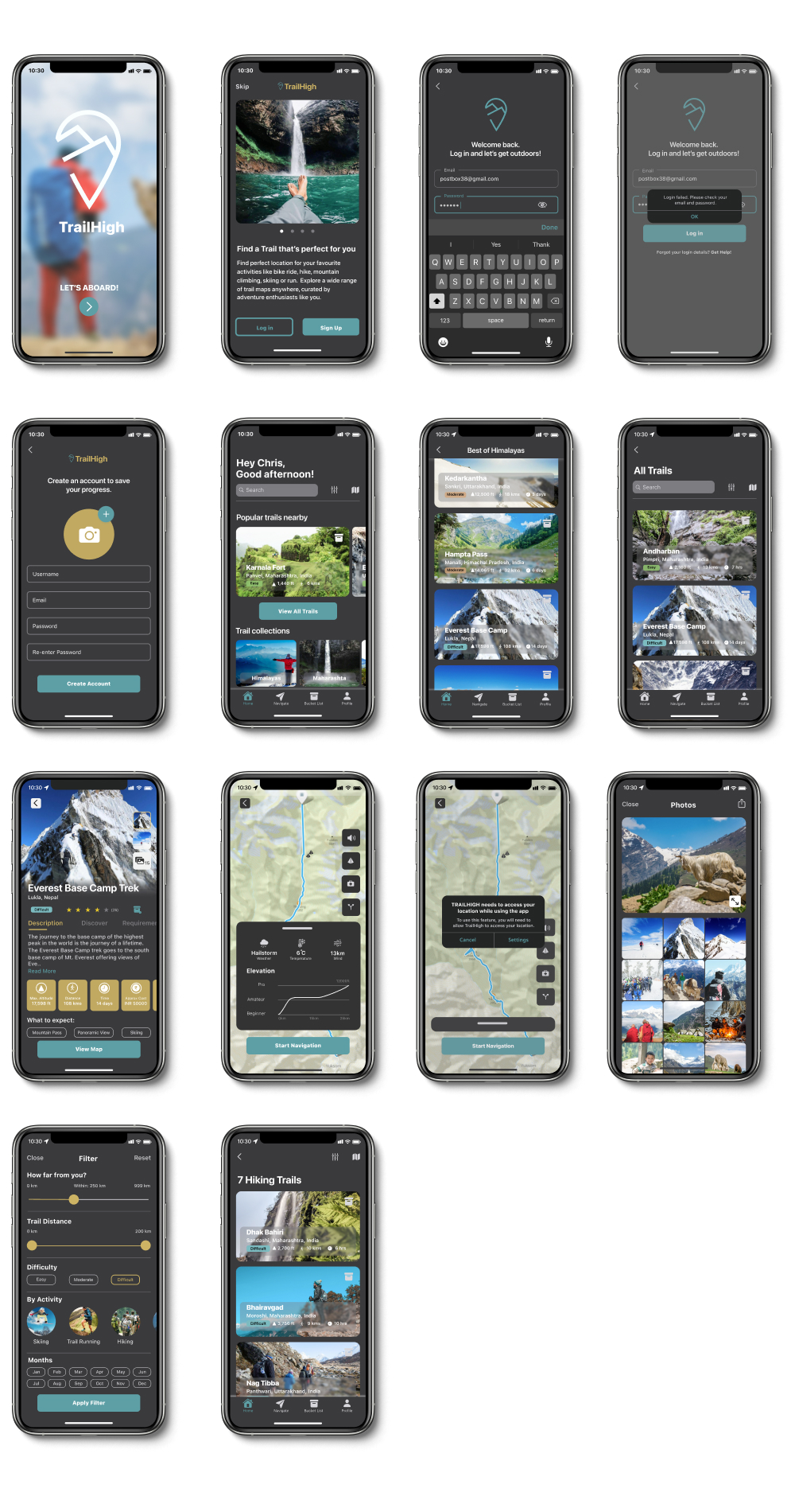
iOS
Apple’s iOS Human Interface Guidelines was followed for designing iOS version of this app.
Retrospective
What went well?
Learning how iOS and Android platforms maintain their designs consistently to keep their brand a recognised and reliable entity was new and fascinating to me. Also, finding new ways to meet my design ideas with the design guidelines provided by platforms challenged me as a UI designer.
What didn’t go well?
Maintaining the consistency of styling according to the respective guidelines was a tiresome procedure.
What can be improved?
Finding more existing trekking and travel apps within the platforms and observing how the interface design of these apps while adhering to the guidelines enjoys creative freedom.

