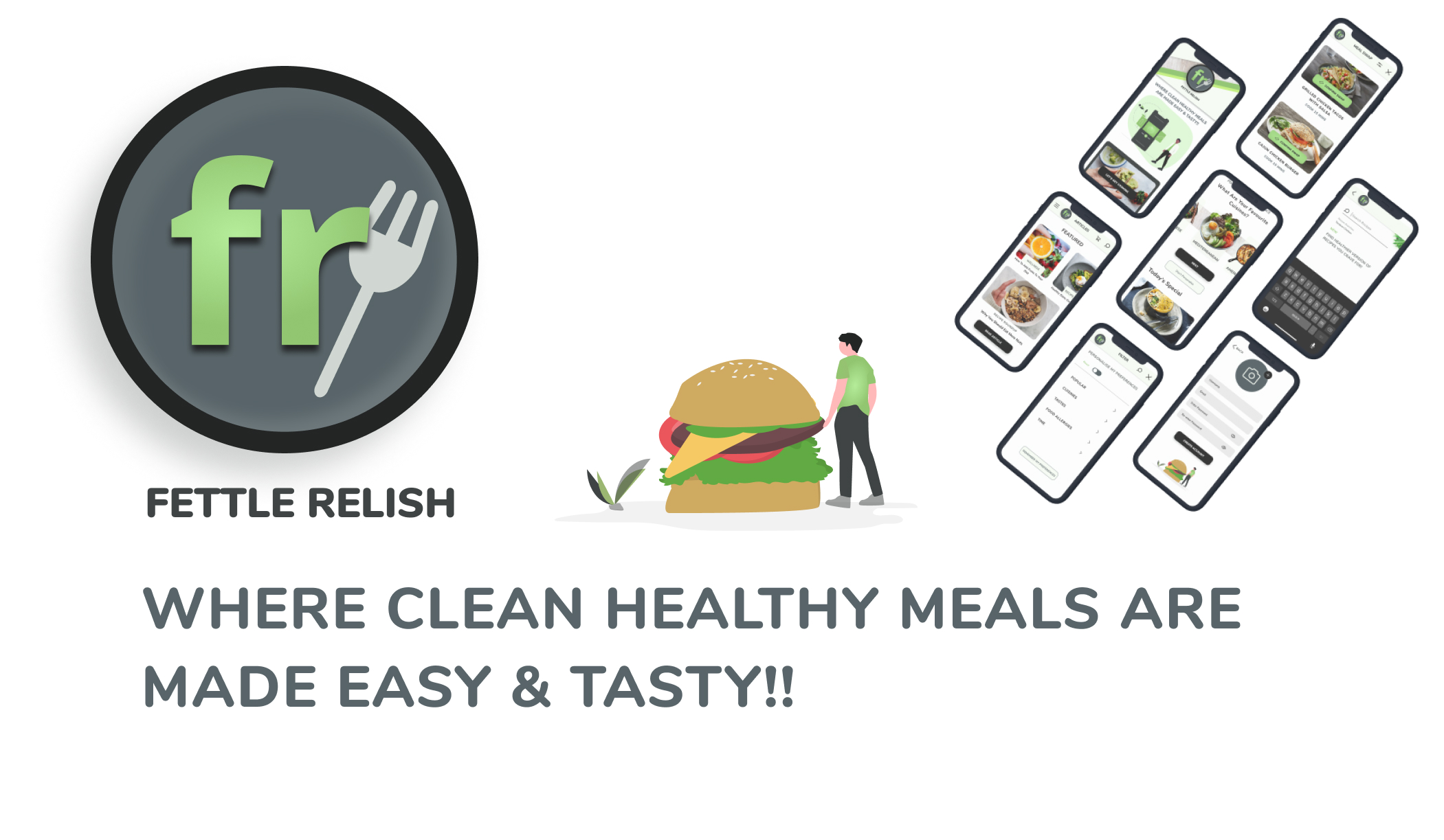

About The Project
There is a misconception around eating healthy or eating clean. These ‘healthy’ and ‘clean’ meals are often considered boring, bland, complicated to make and tasteless.
PROBLEM
During these tough pandemic times, everyone is aware of the importance of developing a robust immune system and healthy lifestyle. Amidst the busy working schedule and no limitations to new work from home lifestyle, consumption of readily available and ready to eat/fast food meals has become the new lifestyle. This new way of living has taken a toll on health and our natural defence system. But, what is stopping us from taking control of our own lives is this deception about healthy diets and our busy lifestyles.
SOLUTION
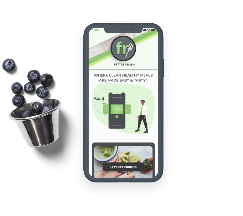
Here, Fettle Relish recipe app proves that including a healthy diet to one’s lifestyle isn’t as boring and complicated as perceived, but it’s just the opposite!
My Role:
UX Designer & Researching
UI Designer
Duration:
3 months
Tool Used:
Process Followed
This project began with the idea of just creating a recipe app with simple ingredients & easily understandable recipes.
As I proceeded, I looked into some of the existing apps in the market and conducted some user researches. From these researches I found out that, most of the users are not keen on joining or downloading any recipe apps. All the required recipes and their making were easily available on YouTube. That’s when I realised that a solid goal or motivation is required for drawing any users to my app.
Considering the present situation, where pandemic has shown the world how important it is to have a strong immune system, I decided to create an app which focuses and forces people to adopt a healthy lifestyle and make them change their habit of bingeing on fast foods.

Competitive Analysis
A competitive analysis was conducted by looking at Recipe App/ Sites. The analysis included:
Competitive Overviews
Marketing Profile
SWOT analysis
UX analysis
With a defined purpose, I researched some apps which focuses on health only and conducted a SWOT analysis to determine where these apps succeed and where it requires improvements.
For my target users, I wanted working adults who find it difficult to find time to prioritize their health.After finding my users, I conducted user interviews to identify their problems, needs and their opinion about this recipe app.
Defining User Needs
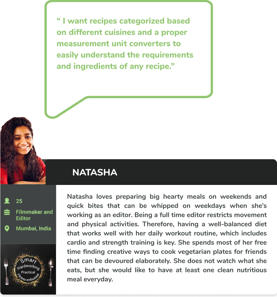
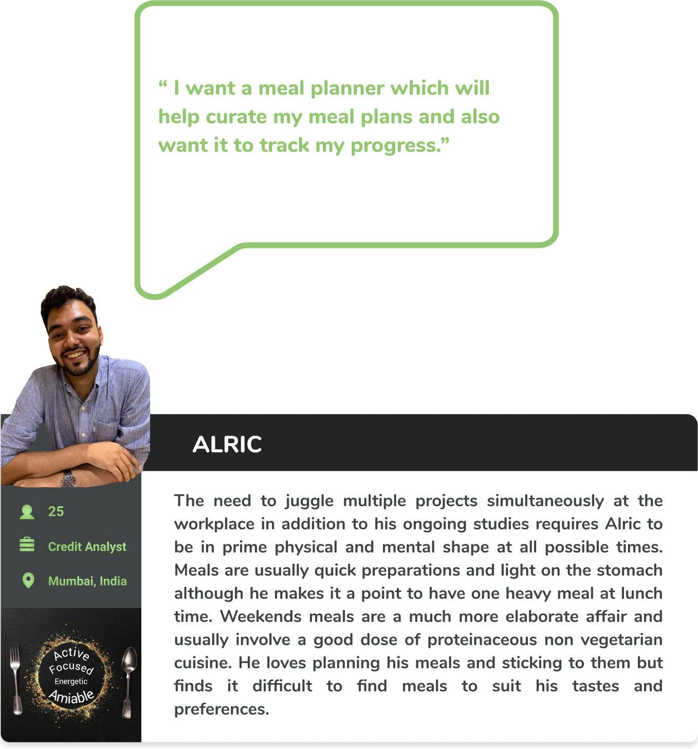
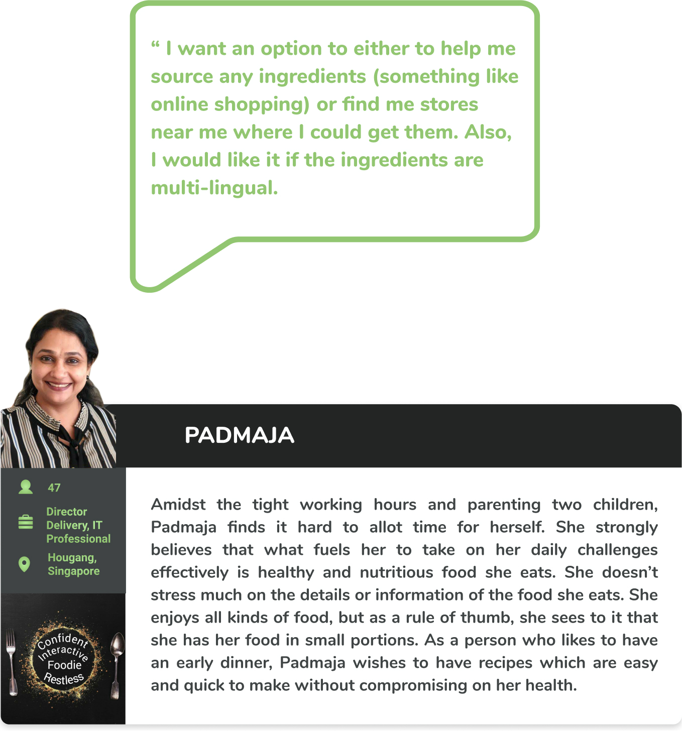
Following 3 user personas were created based on my analysis, evaluation and observation of these individuals extracted from the user interviews.
The users I chose represents my target audience; Working adults. Though the troubles of having to maintain their health and well-being amidst their busy schedules and workloads is common to all, the difference in their personality and perspective is what I could use to build a better usable app.
From my observations and results of interviews conducted I have derived the following Hypothesis:
Hypothesis
User would be educated about the benefits of healthy and wholesome eating. The misconception and deceptive image of healthy diets being bland, less and out of the routine thing will be proven wrong with this app. Healthy meals can be tasty and interesting. With a consistent following of recipes from this app, the cravings and desire for processed and high sugar foods will diminish to zero.
Patterns
There is a prevailing misconception about health- based meals being boring or too strict.
Despite its unpleasing nature, all users are aware of the importance and benefits of healthy eating.
Having the power to choose and customize meals.
Surprises
I was surprised when one of the users I interviewed pointed out a genuine problem of not providing an option to find the local term of any ingredient according to the location/region where the user stays.
Frustrations
Not having a proper measurement unit conversion option.
Unavailability of the customized recipe according to portion sizes.
Not having options to source ingredients as all ingredients are not readily available in the stores.
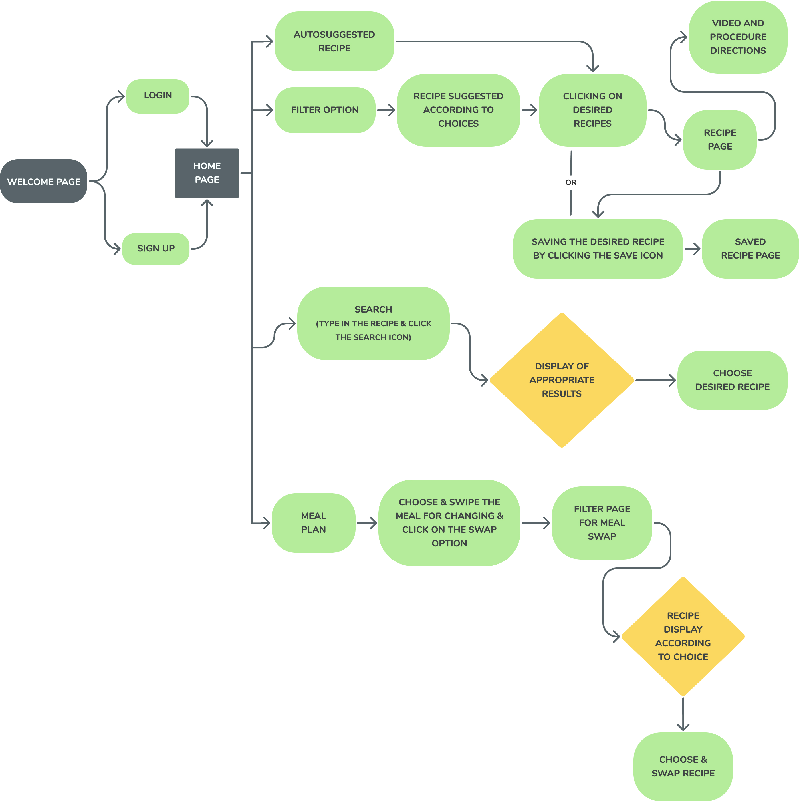
The insight I recieved from these interviews helped me figure out some genuine user-centric problems. From the information collected, I could draw out low fidelity wireframes and user flows with possible best solutions.
User Flow
MVP
Minimum Viable Product
To help users look for healthy and new recipes according to their tastes, preferences and health conditions.
To ensure users enjoy benefits such as saving their favourite recipes, sharing and creating their meal plans.
To gain approval and validation from users and to actively help them follow and maintain a healthy lifestyle.
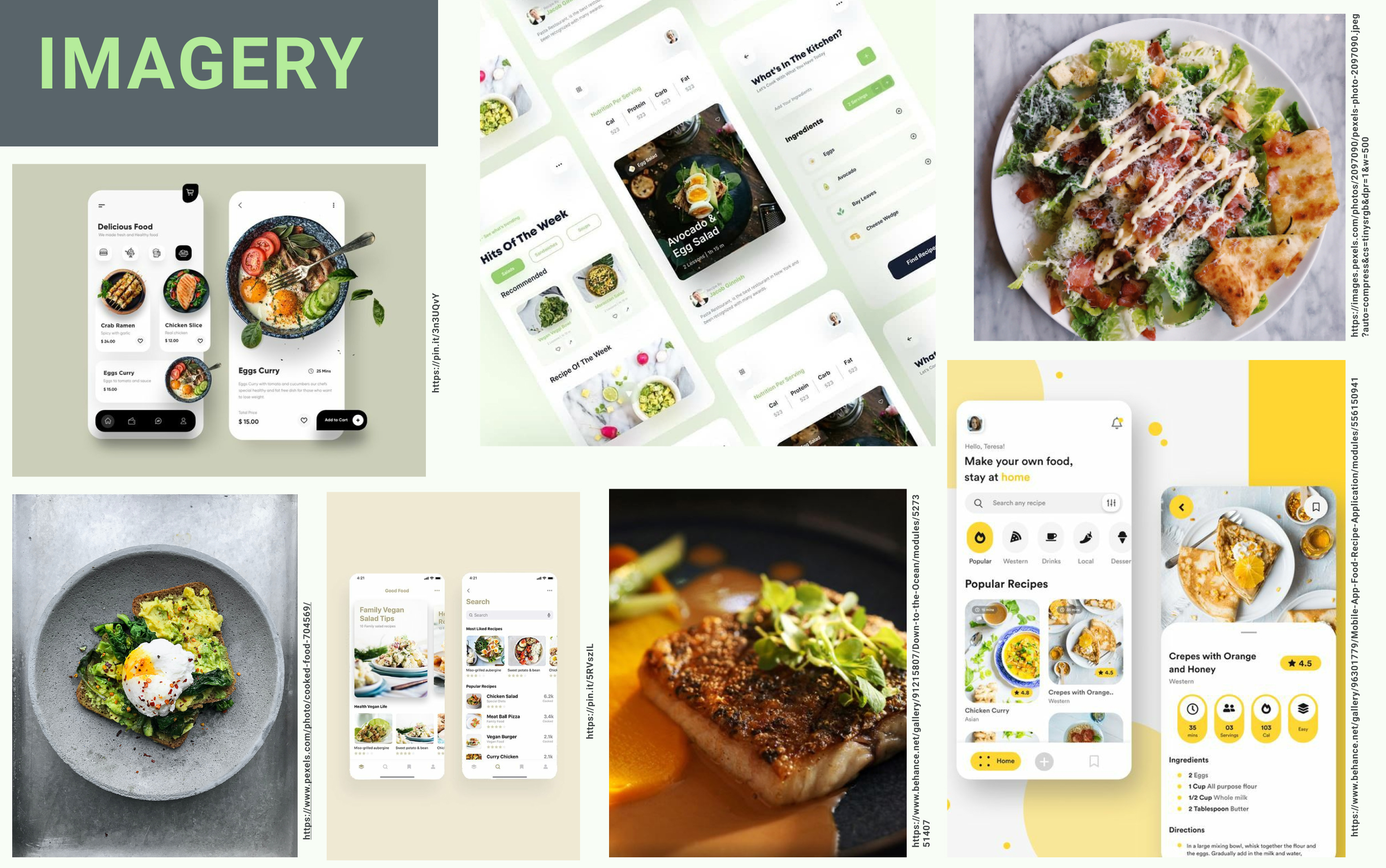
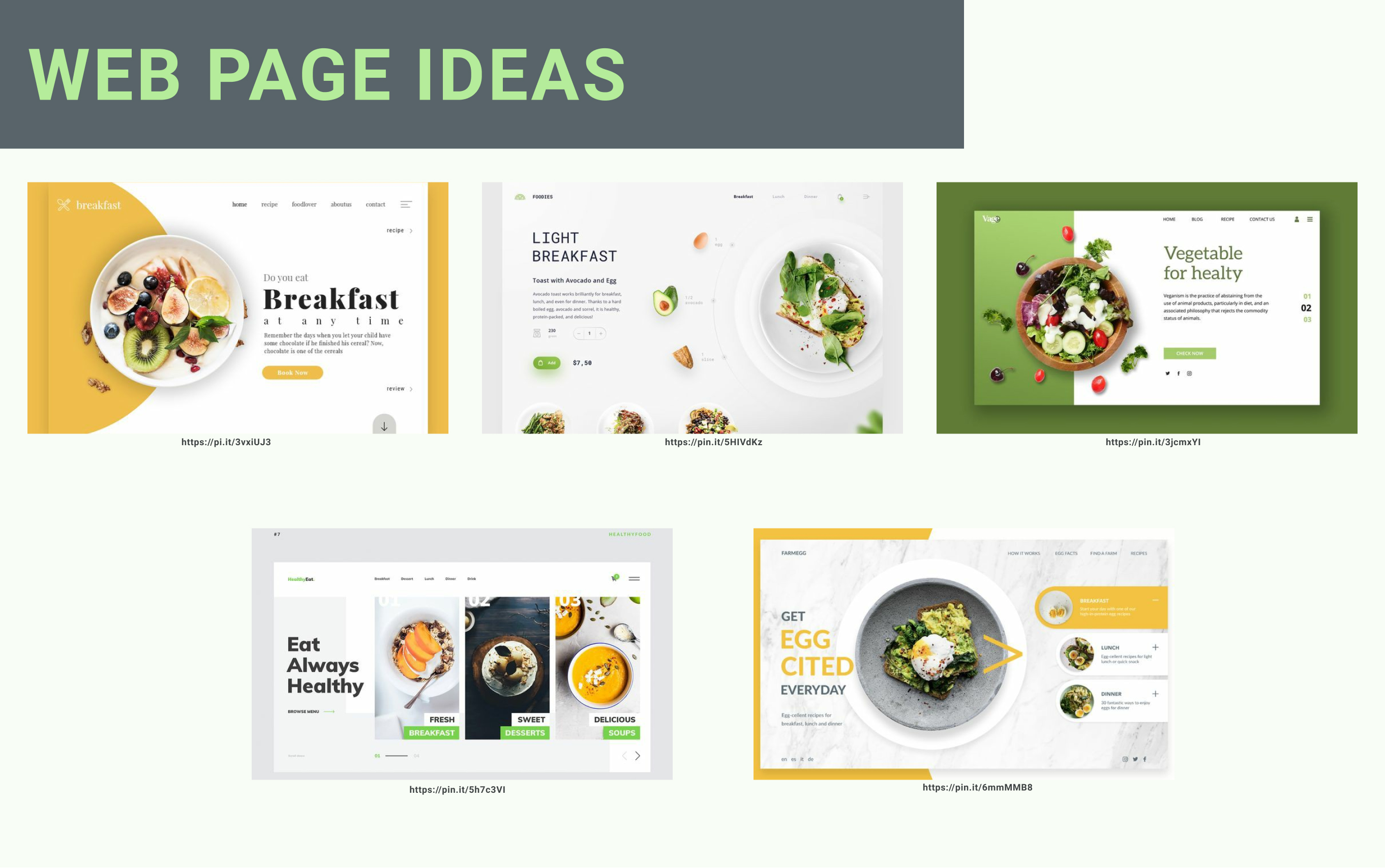
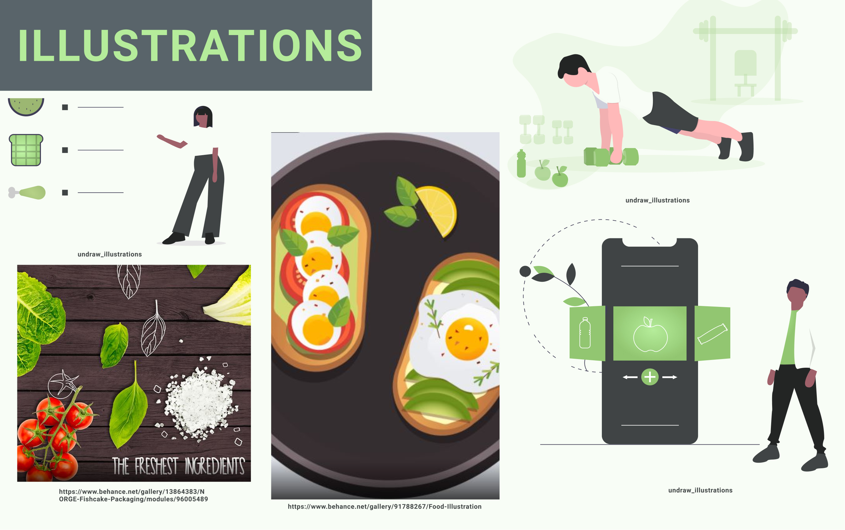
Mood Boards and Inspirations
I developed two moodboards to find out which concept could represent the intention and express the importance of health and fitness.
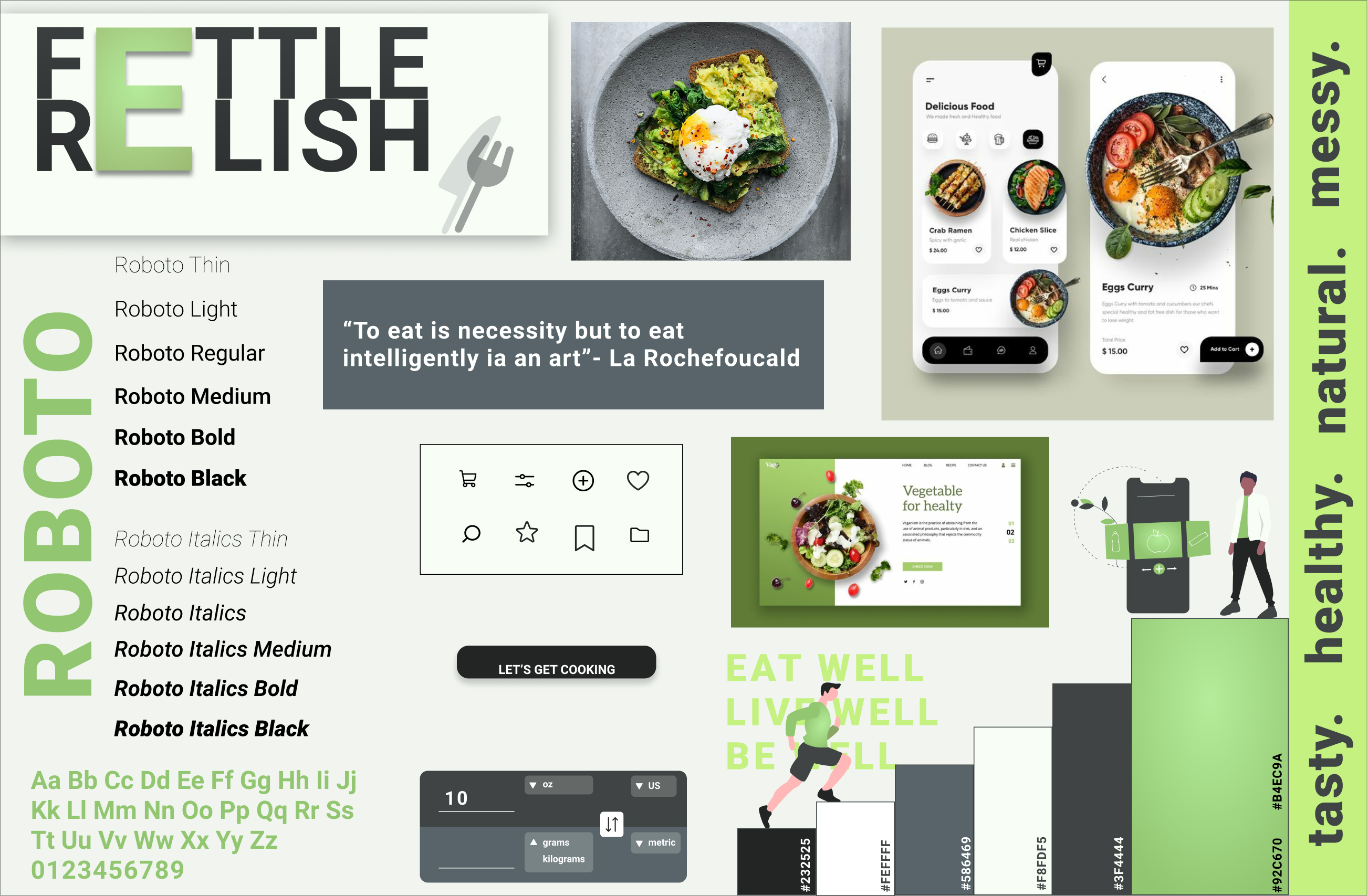
Healthy, Raw, Natural, Tasty
The idea here is to present fresh, natural and health-related app that not only refreshes the user’s intention of going healthy whenever they visit this app but also motivates the users to keep coming back. The idea of food being too colourful and aesthetically presented is broken here and with this app users will be convinced that food can be raw, messy, tasty and easy to prepare.
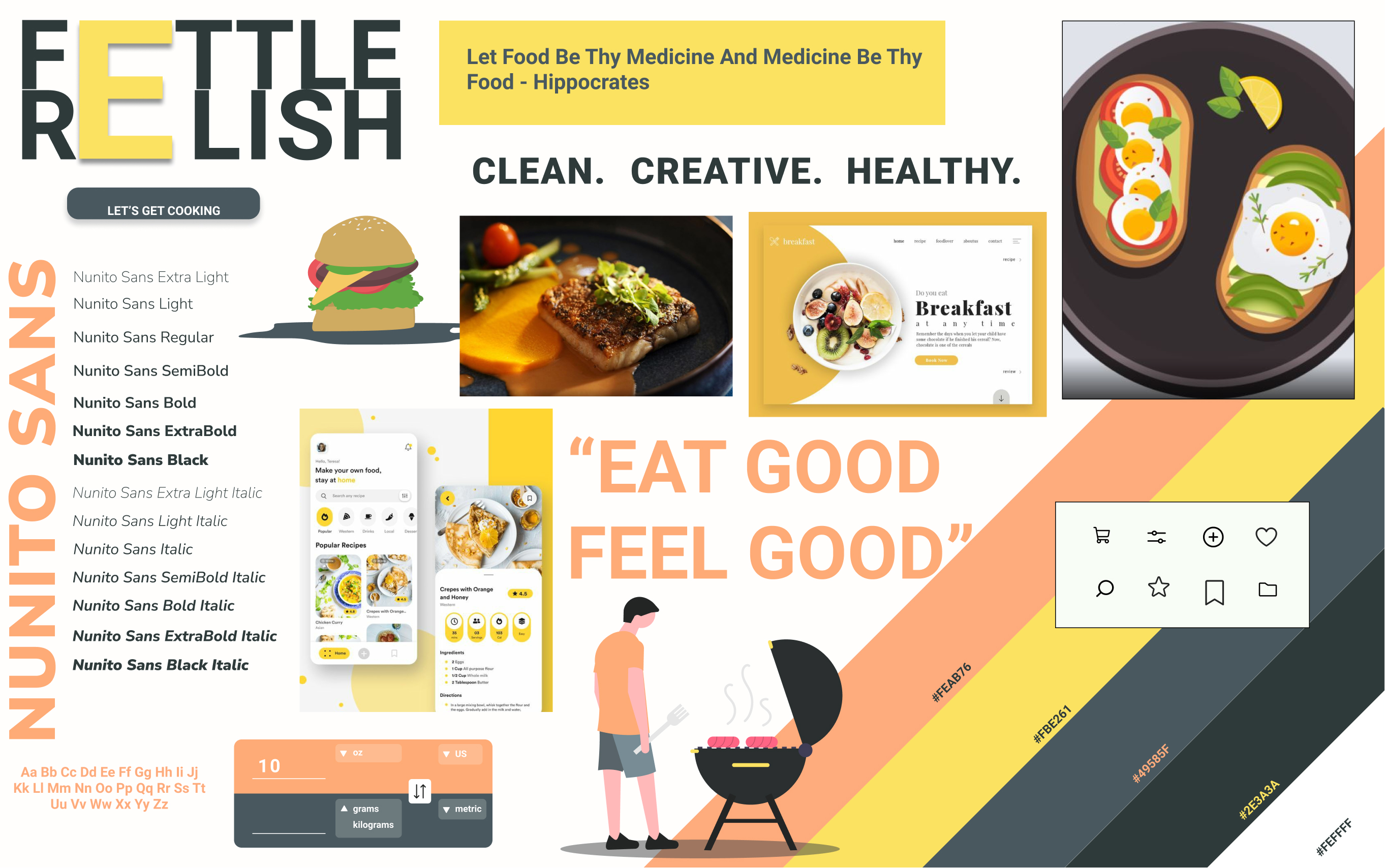
Clean, Creative, Pleasing
This idea represents the most available recipe app in the market, filled with colours and mouth-watering recipes. Though, the intention of healthy eating can be brought with this concept but doesn’t seem convincing.
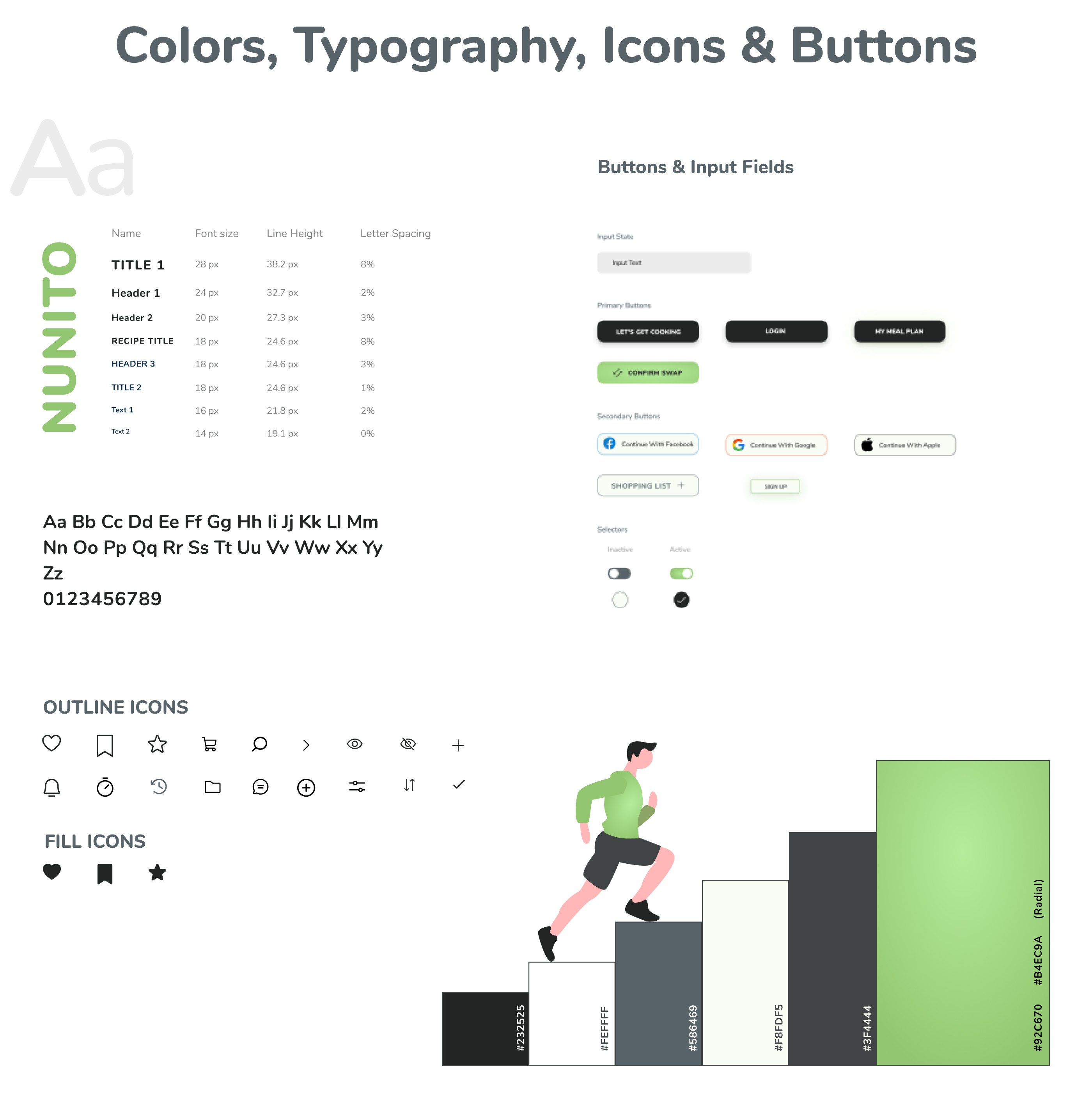
For my app I chose the green theme as it symbolises health and well being.
I finalised Nunito Font as my font for all texts.
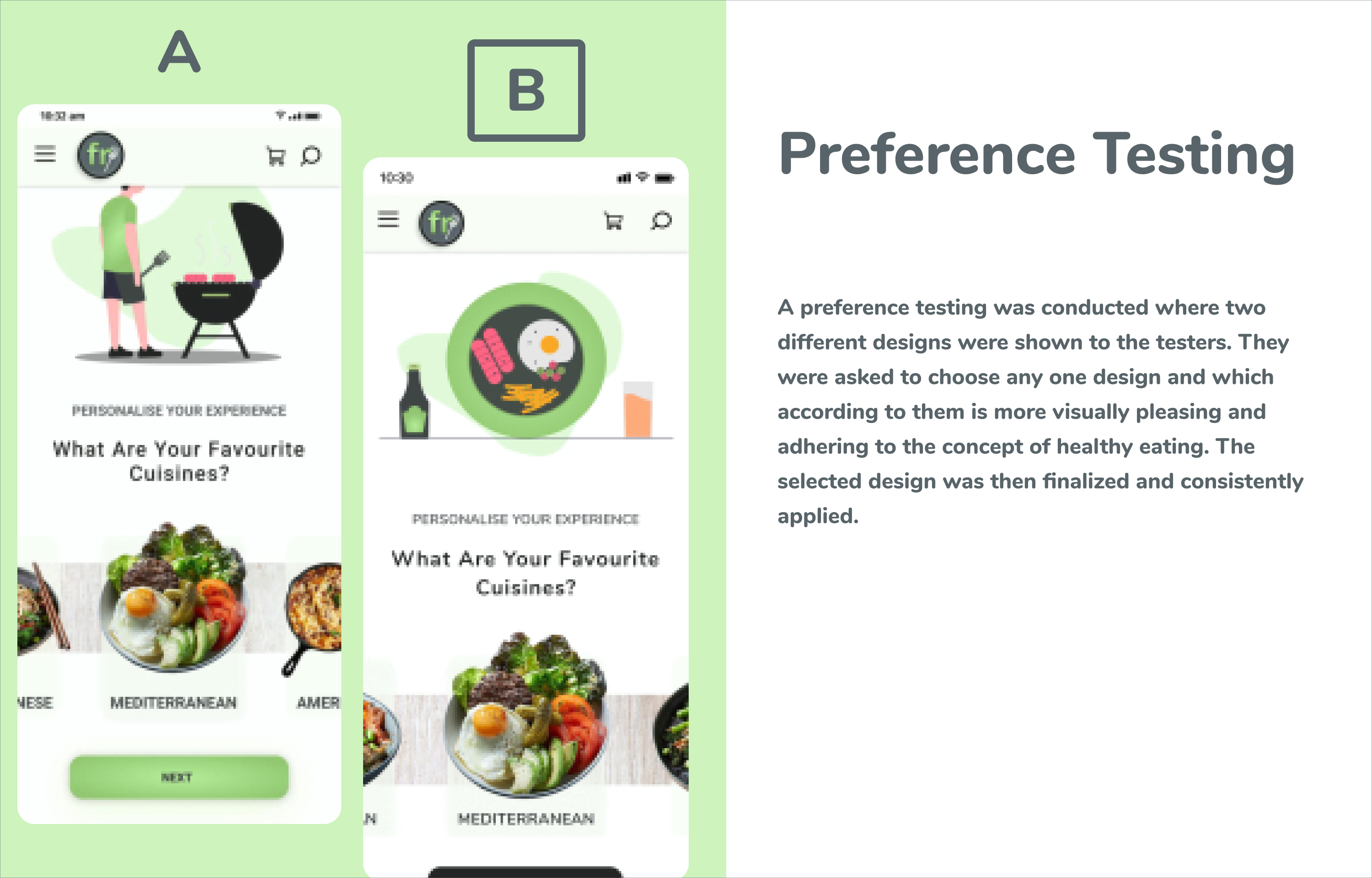
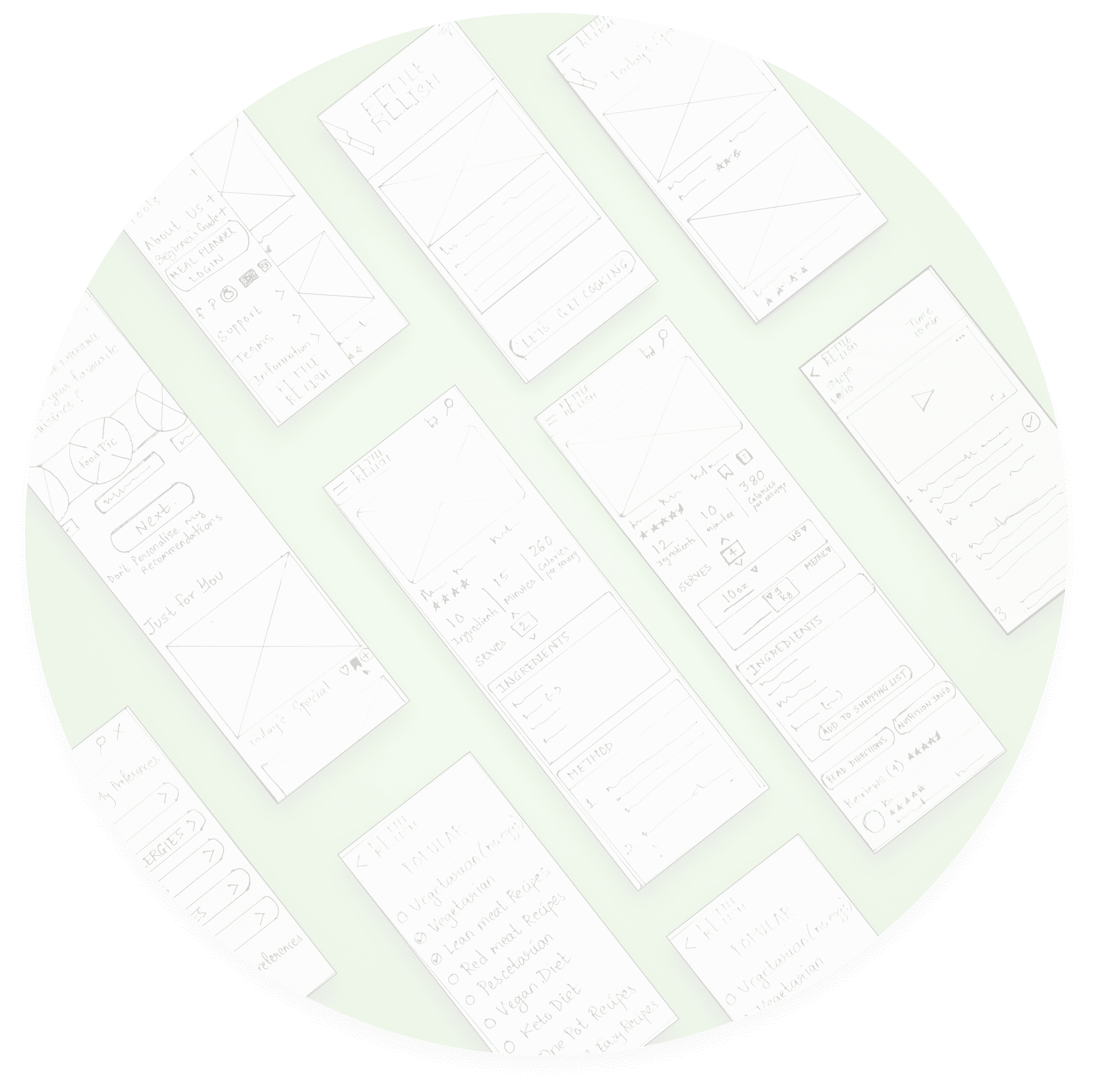
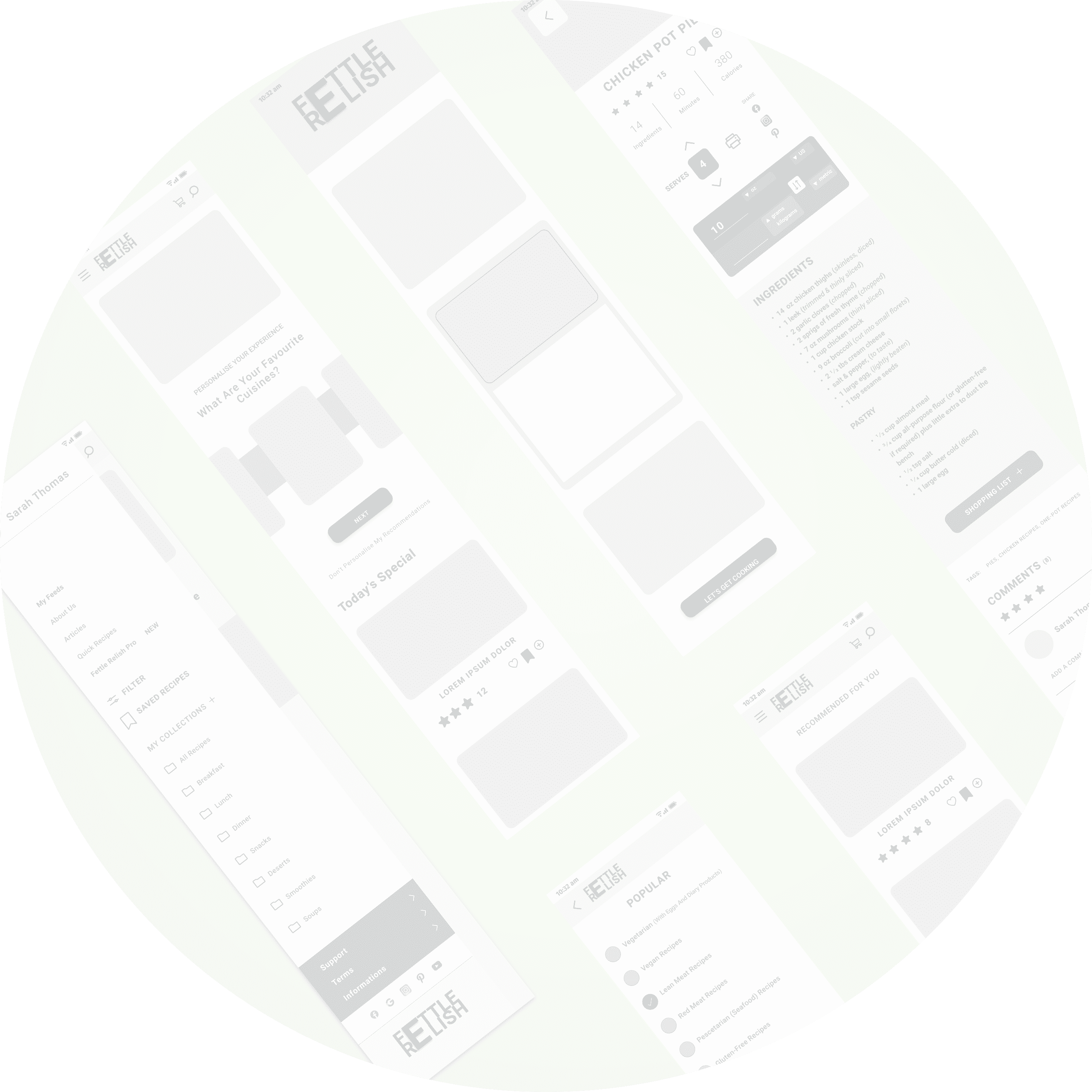
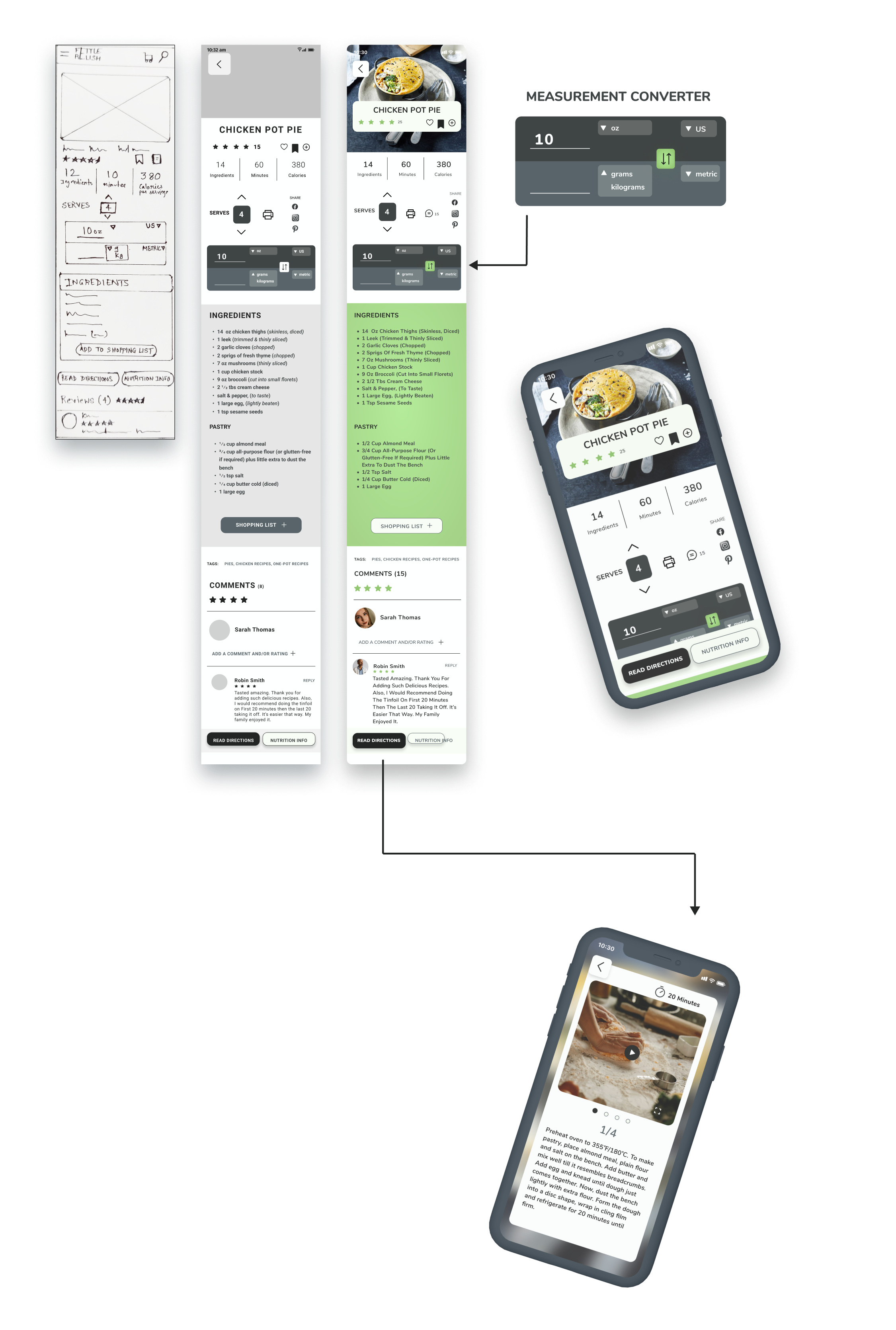
Wireframing Progression
“ I want recipes categorized based on different cuisines and a proper measurement unit converters to easily understand the requirements and ingredients of any recipe.”
Usability Testing
After prototyping, my target users and some of slack community members were given the link to test the flow and navigations of the design.
Reviewing & Critiquing
Users who tested the prototype found it logical and detailed. Some have even expressed their desire to use the app for real.
“ I like the shades of gray with the cool green color and light background color - It gives the screens a clean, fresh feel. On the smallest/mobile screen the back button at the top is quite large, maybe you could make this smaller it distracts from the image. I think you’ve done well with your typography and hierarchy - it’s clear and easy to understand. Last I really like the idea that you have included a converter for imperial to metric. As an American in New Zealand that would be great to have when looking at recipes. Cheers!’ - Esteban Garcia ( Slack community member)
“ Beautiful colour palette that complements the delicious looking images. I love the rating at the top and the ability to like, save or add; something I do when I see something I want to explore more but don’t have time just then. The soft shadows for the call to action makes me see what the next steps are. User reviews also a great way to assess the product. Very happy to see the total calories on the top right and time taken, important for me when deciding what to eat/cook. I assume the up and down arrows with the serves selector will change the ingredient amount, clever! My one concern is the share icons may be a bit hard to select on the mobile screen with your finger. The stacking of measurement selector in the gray box made the text legible at small size. The layout is clear, uncluttered and elegant. Congrats.” - Monica Lindin ( Slack community member)
Positives
Good colour choice and combination
Measurement converter is helpful
Good typography and hierarchy
Ability to save, add and like recipes is helpful
Calories counts saves time choosing a recipe to cook
After corrections and changes the design was finalised!
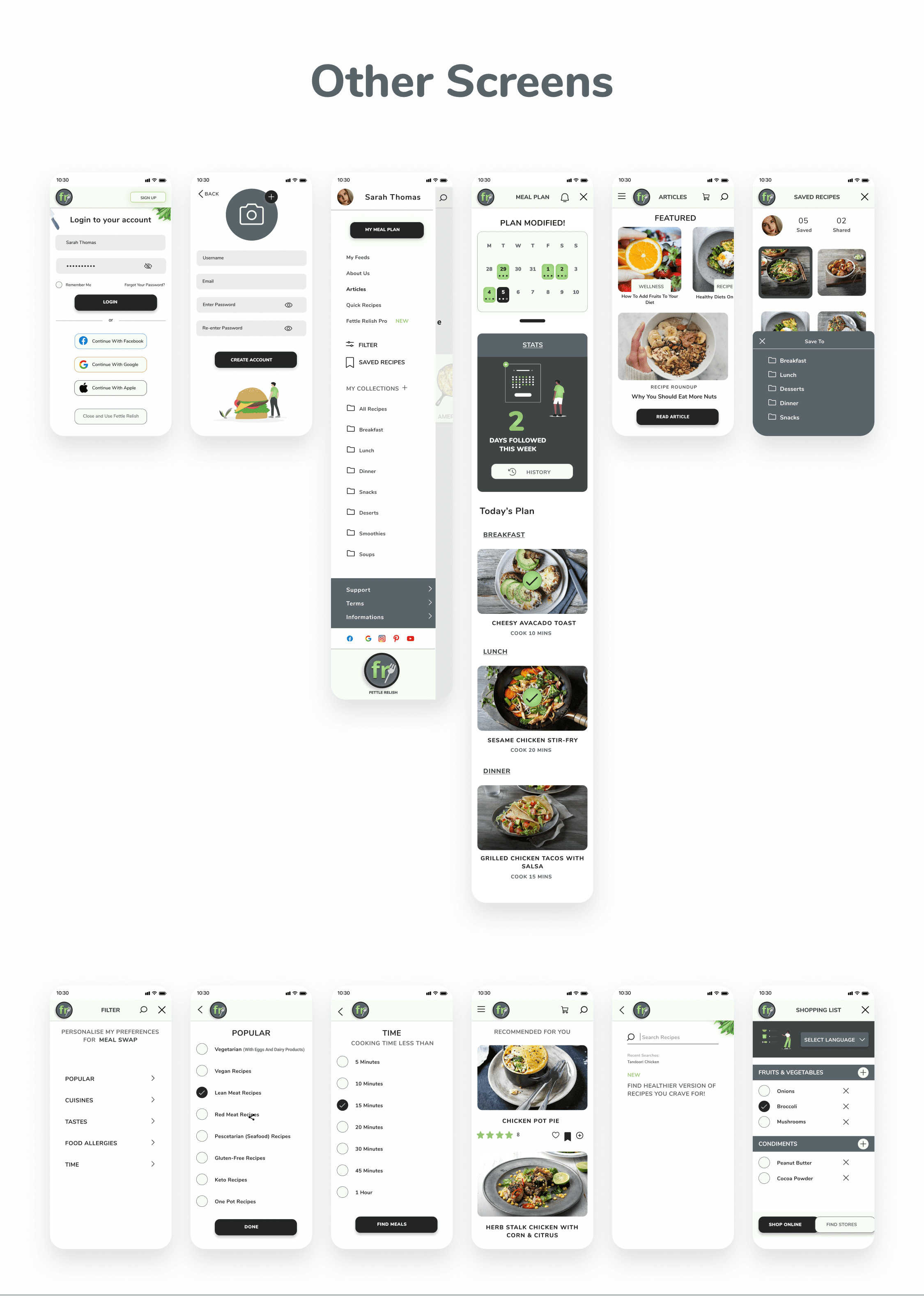
Featured Screens
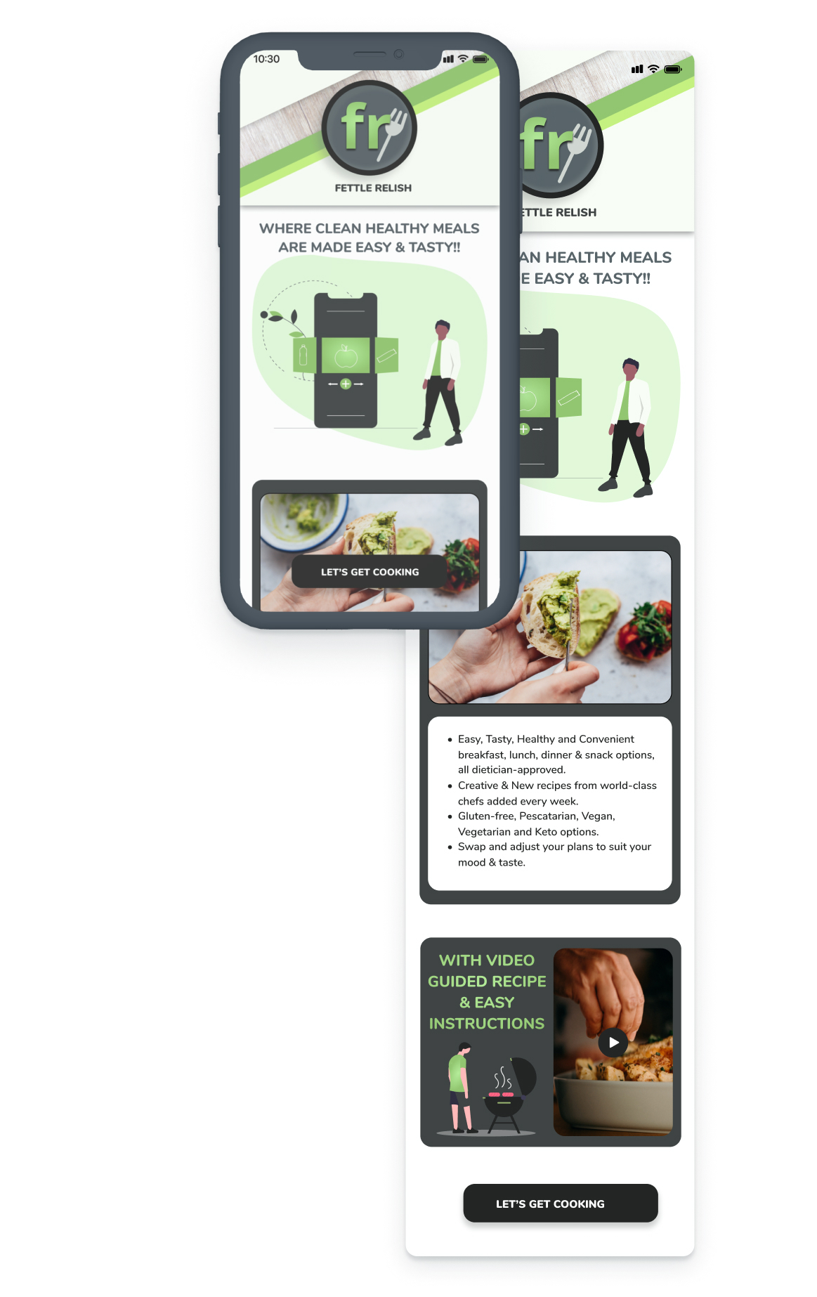
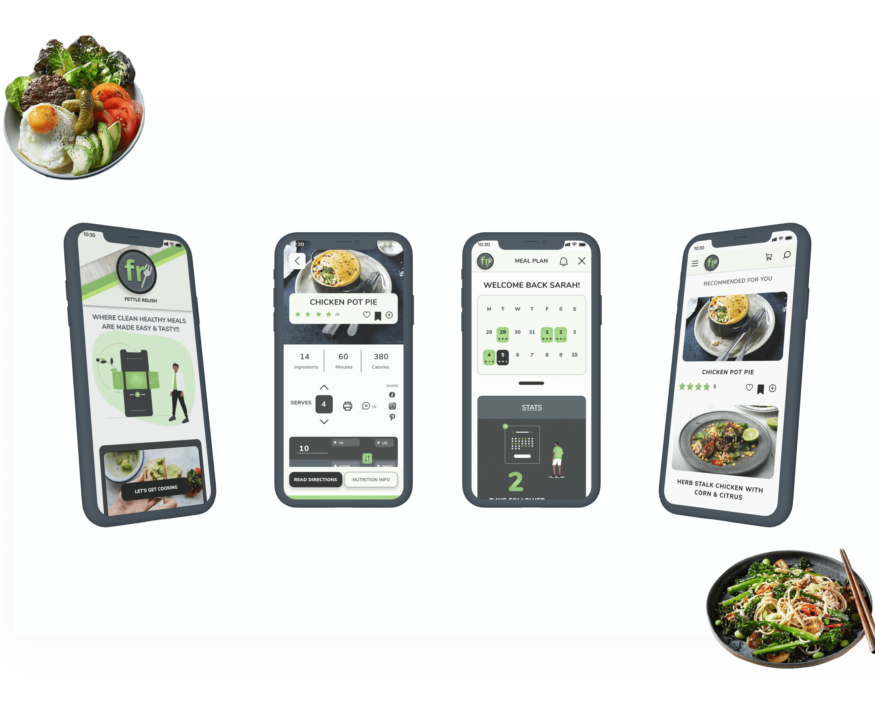
Welcome Screen
Home Screen
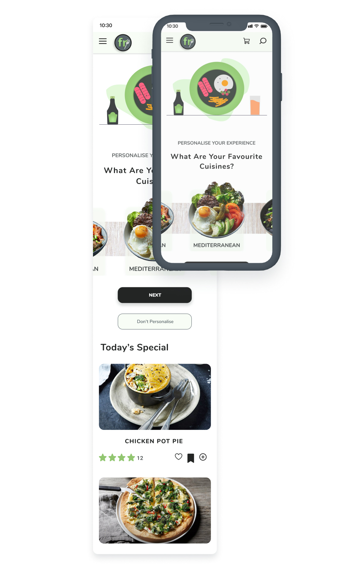
Choose your favourite cuisine and get all the recipes!
Filter Screen
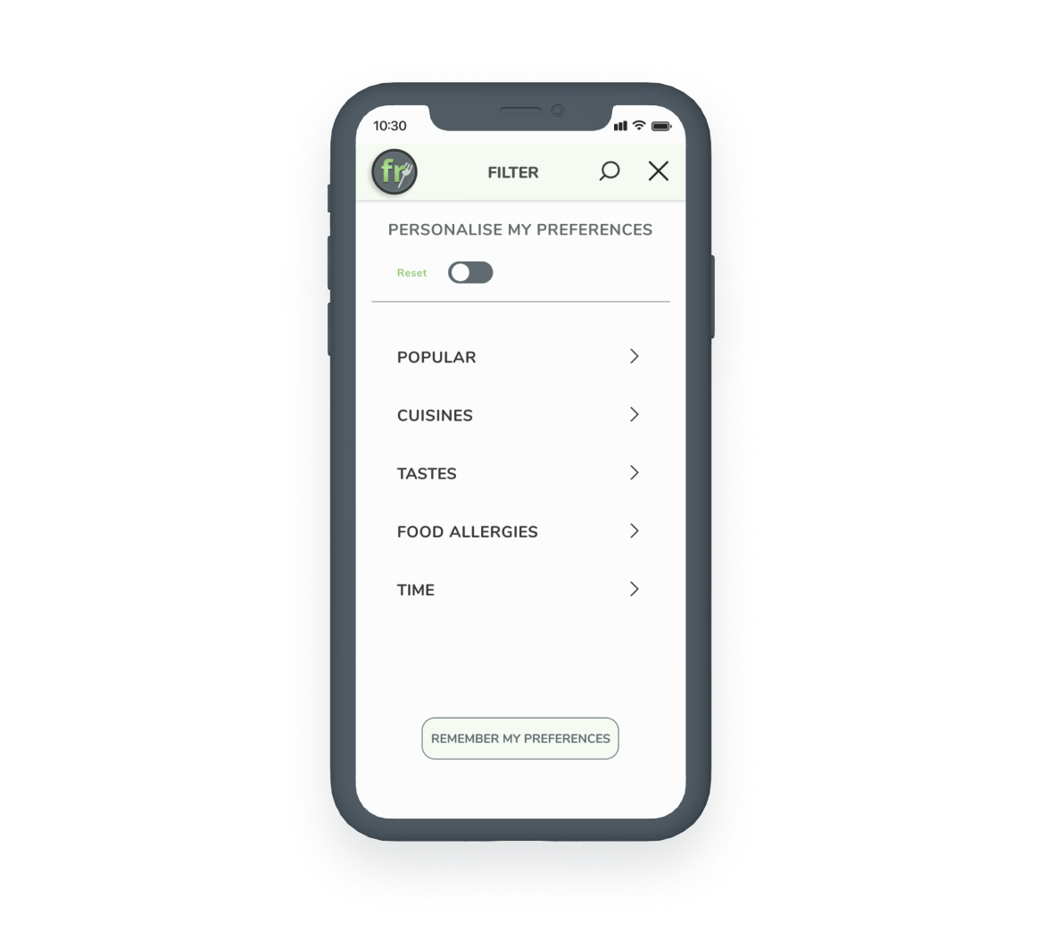
Filter and Personalise your recomendations
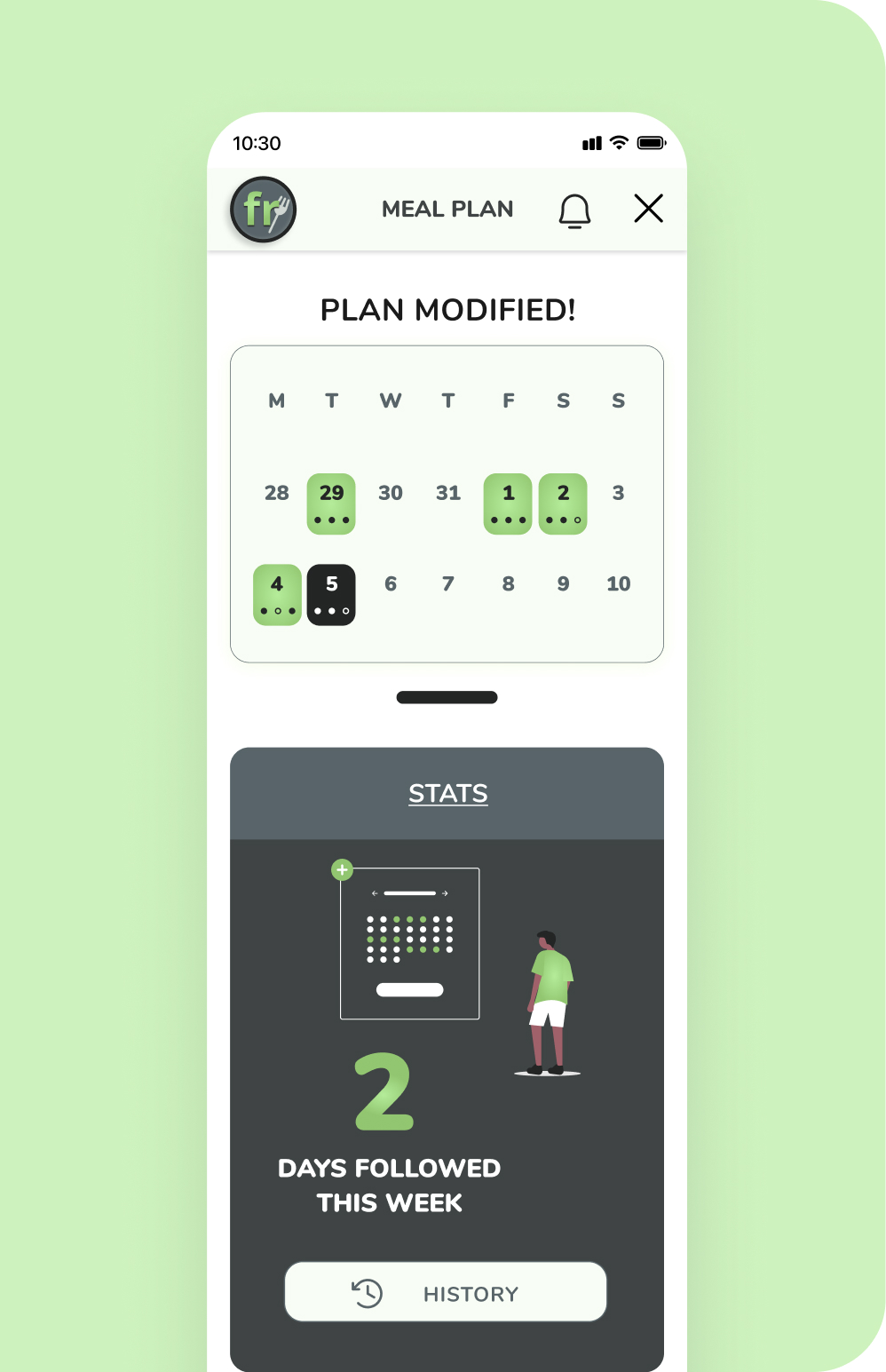
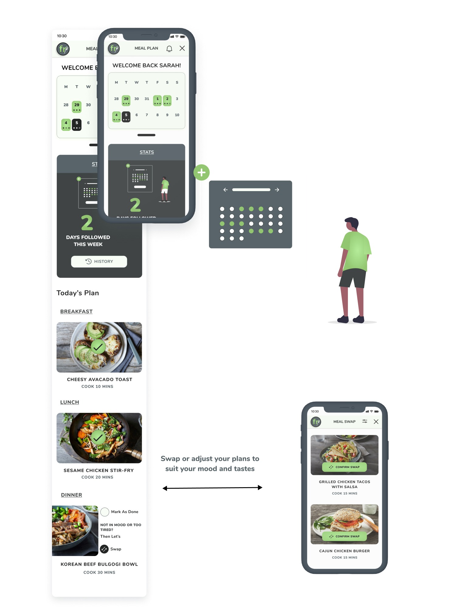
Meal Plan and Recipe Swap option
Plan your meals for the day with meal planner
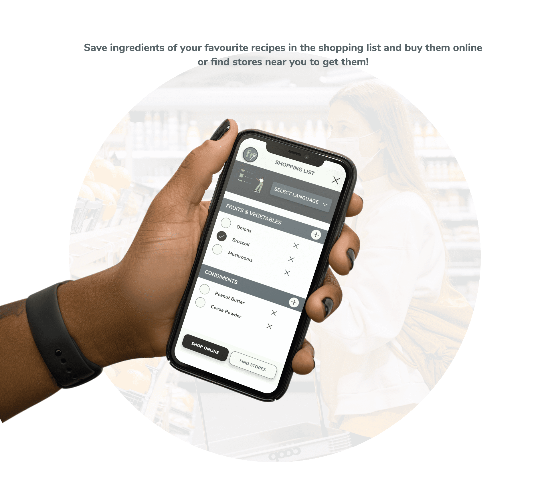
Shopping List Screen
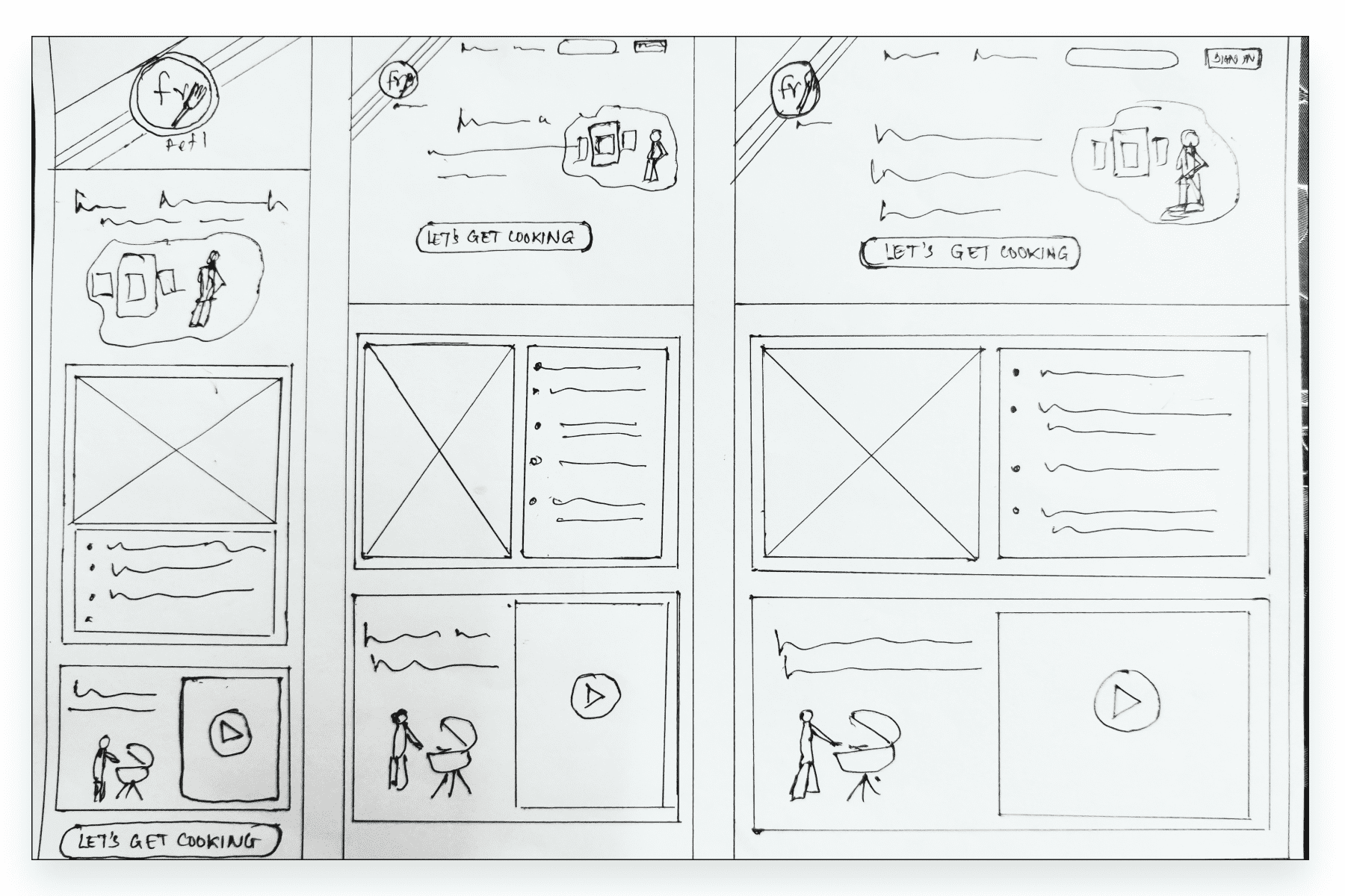
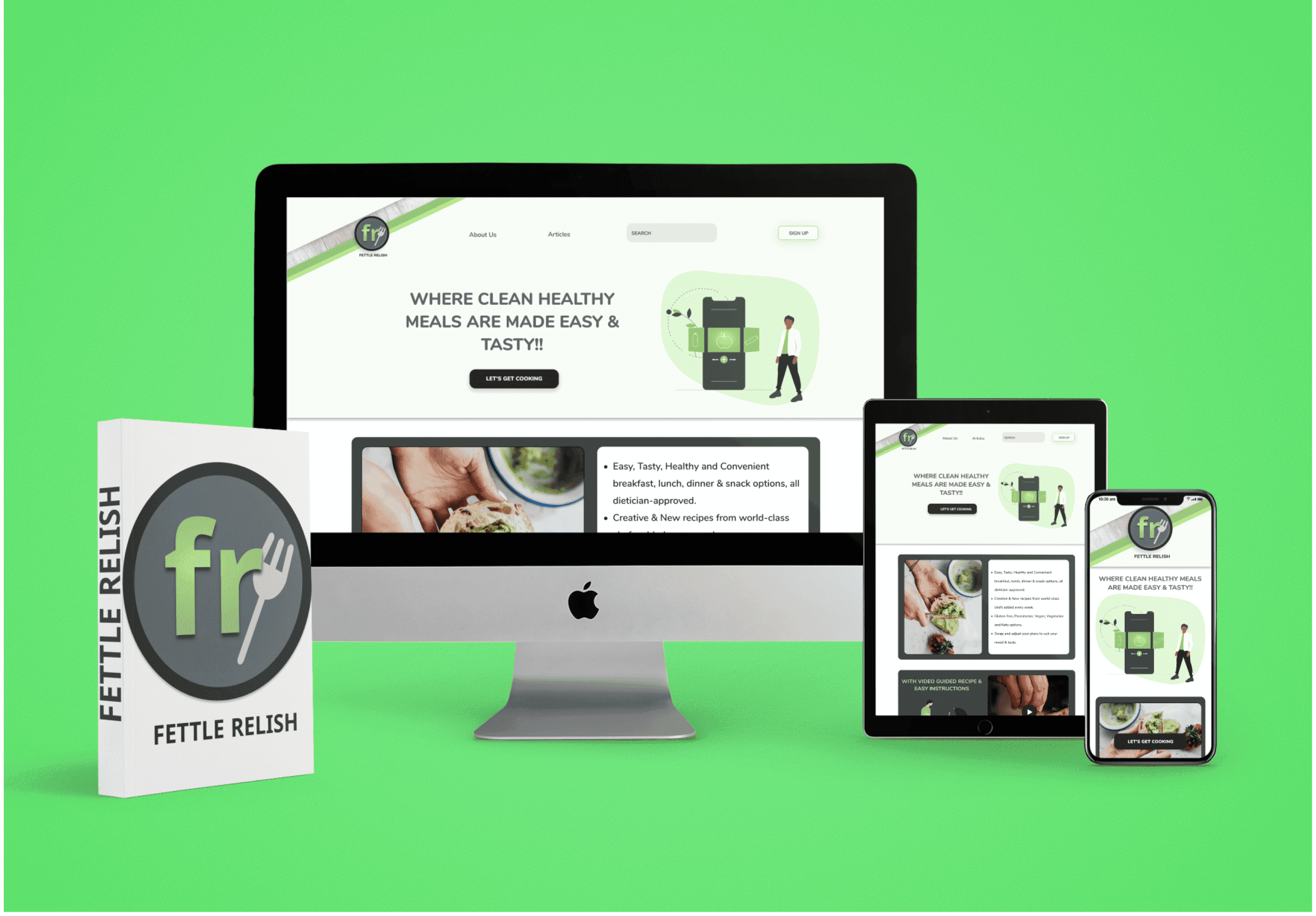
Responsive Designs
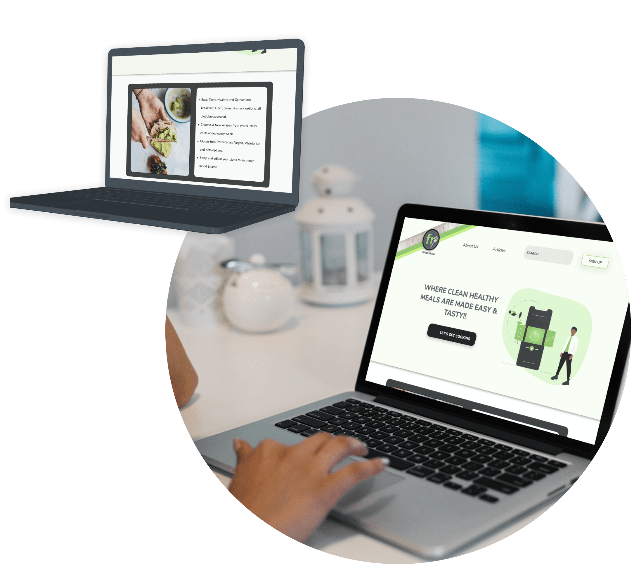
The UI design process started with ‘Mobile First’ approach. All designs were first hand sketched for the mobile version of this app, which was later made responsive by determining the breakpoints and sketching for larger devices. The designs for all screen sizes were tested during wireframing.
Retrospective
What went well?
SWOT analysis and research on the existing app gave me an idea of how a recipe app should look and function as I have never used one before. Secondly, I loved the sketching and protyping phase. Being a person who likes to draw, sketching the wireframes was the best part of the project for me.
What didn’t go well?
Planning my user interviews and scheduling time didn’t go so well for me as the users I chose for this app were an exact representation of my target audience; Working Adults. To take out some time from their busy schedule turned out to be troublesome to me. Apart from this, a lot of time was spent on defining a proper user flow.
What can be improved?
A proper planned action can be taken next time. Having an overview of the tasks at hand, planning my work accordingly and considering possible contingencies is required. Also, there is a need to develop my time management skills.
