About
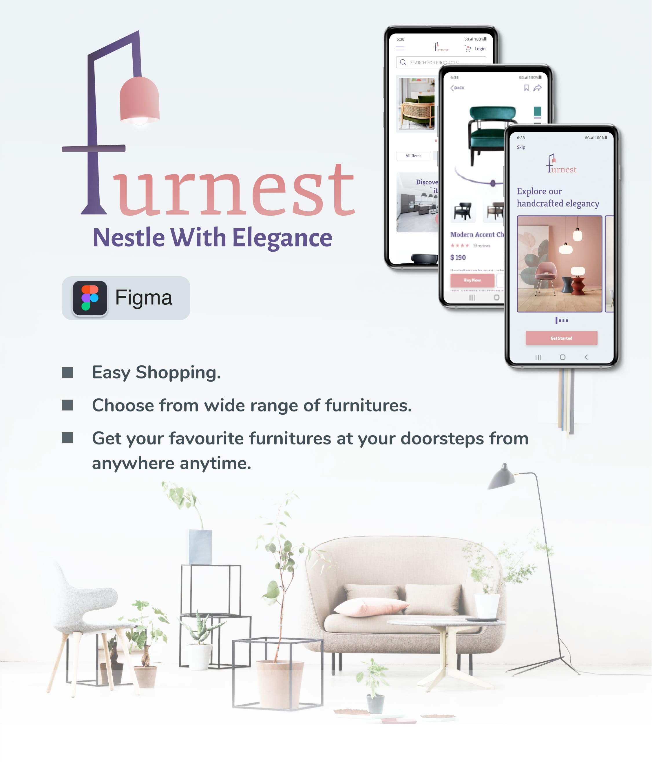
Going to the nearest furniture studio to get the best and perfect furniture that raises the elegance of your home is a tiring procedure. The pain increases tenfolds when you get to know of the scanty collections the studio offers. This is where the Furnest online shopping app helps you get the ideal furnitures that completes your dream home decor.
Our theory is simple.
At Furnest, designs are celebrated as a vital humanistic tool in shaping the world and give a new definition to luxury and comfort. I believe design should do more than just look good. It needs to consider how each of us live and work, finding creative ways to bring comfort and elegance to your home ...your nest!!!..with just a few touches of your fingers. To that end, I designed this app that suits your personality, personal definition of comfort and make online shopping simple for you.
Who?
For you to help you bring your dream home come alive with just few touches of your fingertips. For highly skilled artisans from rural areas who handcraft these designs for you. Today, 72% of our product sales support the sustainability of these skilled stars.
What?
To present you the designs in their true sense through this app so that you can choose your favourites without having to leave your comfort zone.
Where and When?
Choose and bring home the best works from anywhere. This app is accessible from anywhere, so go ahead select your favourite designs during your free time, in between your work or whenever you find a convenient time.
Why?
When you bring home one of our products, you help Furnest in supporting and sustaining talented artisans and keeping the art of handcrafting alive. The materials we choose to build these products are planet friendly!
My Role:
UX Designer
UI Designer
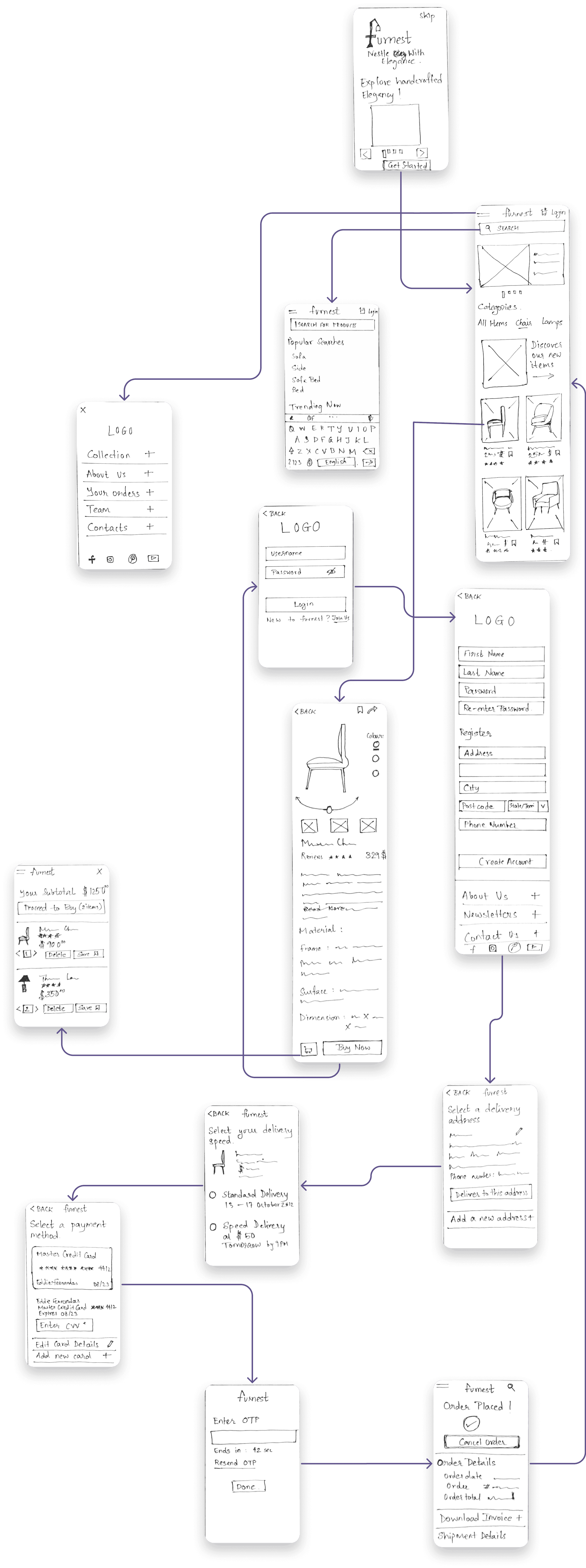
Low-Fidelity Wireframes
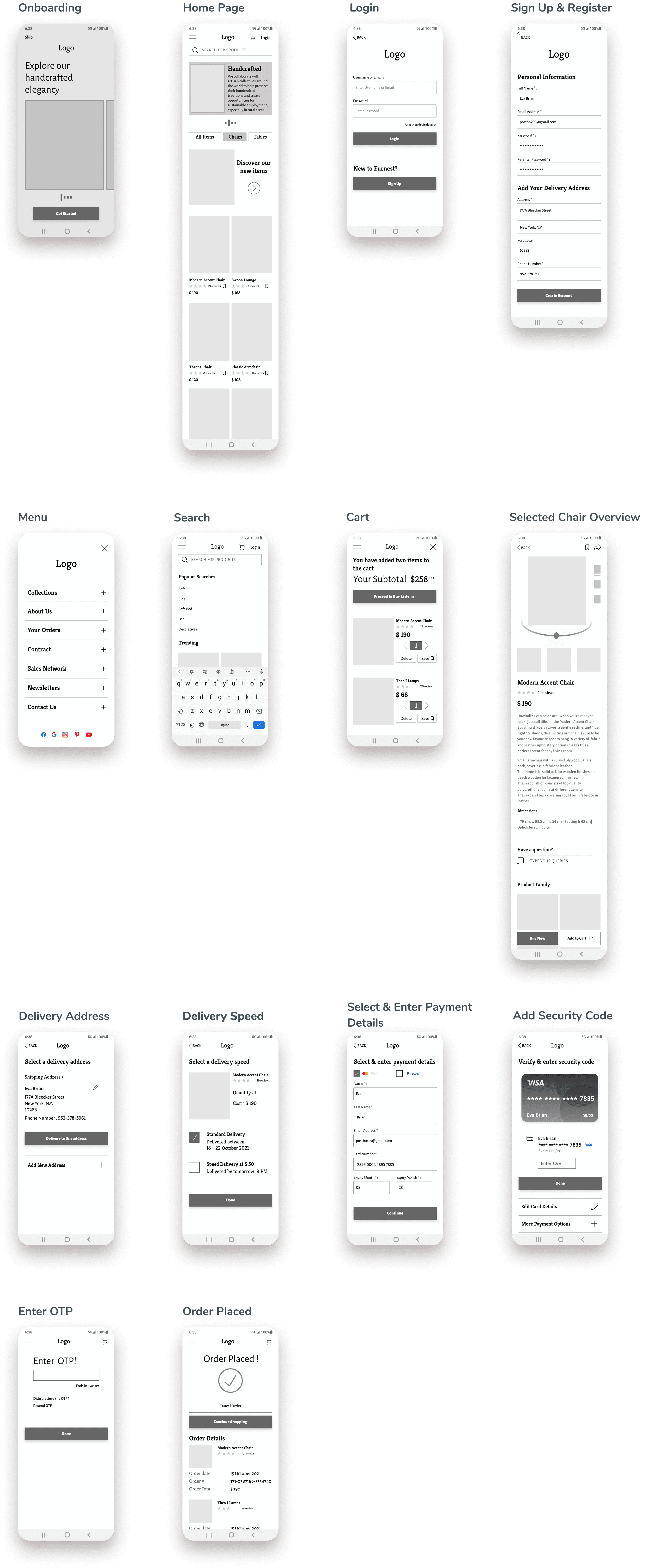
Mid-Fidelity Wireframes
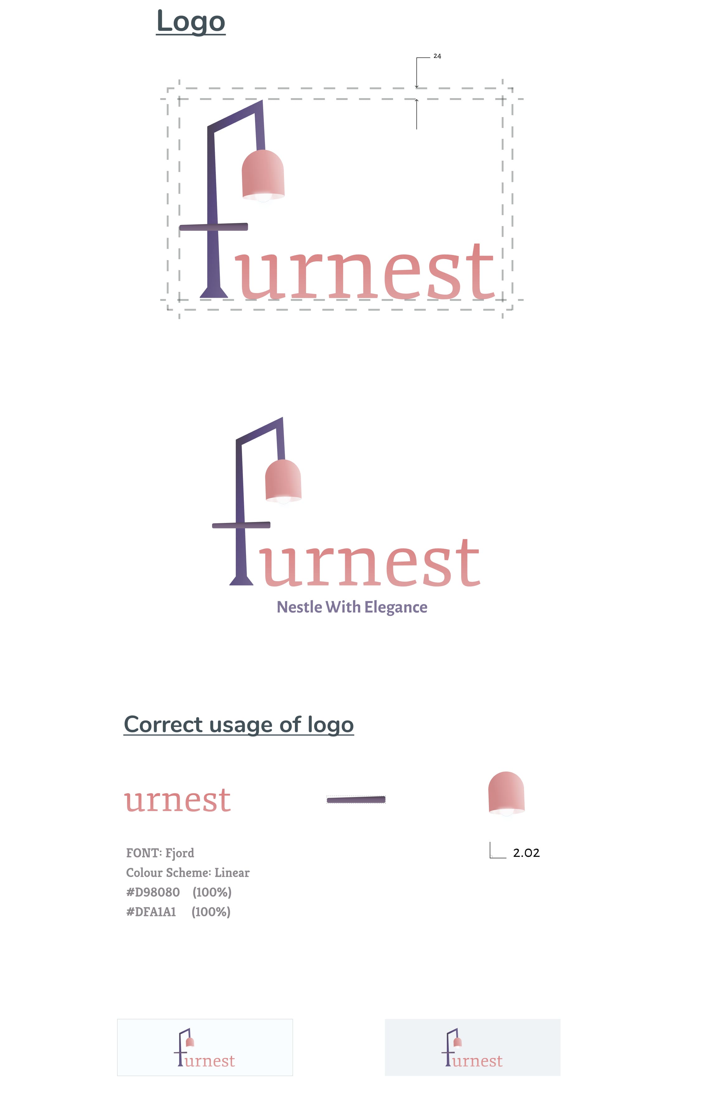
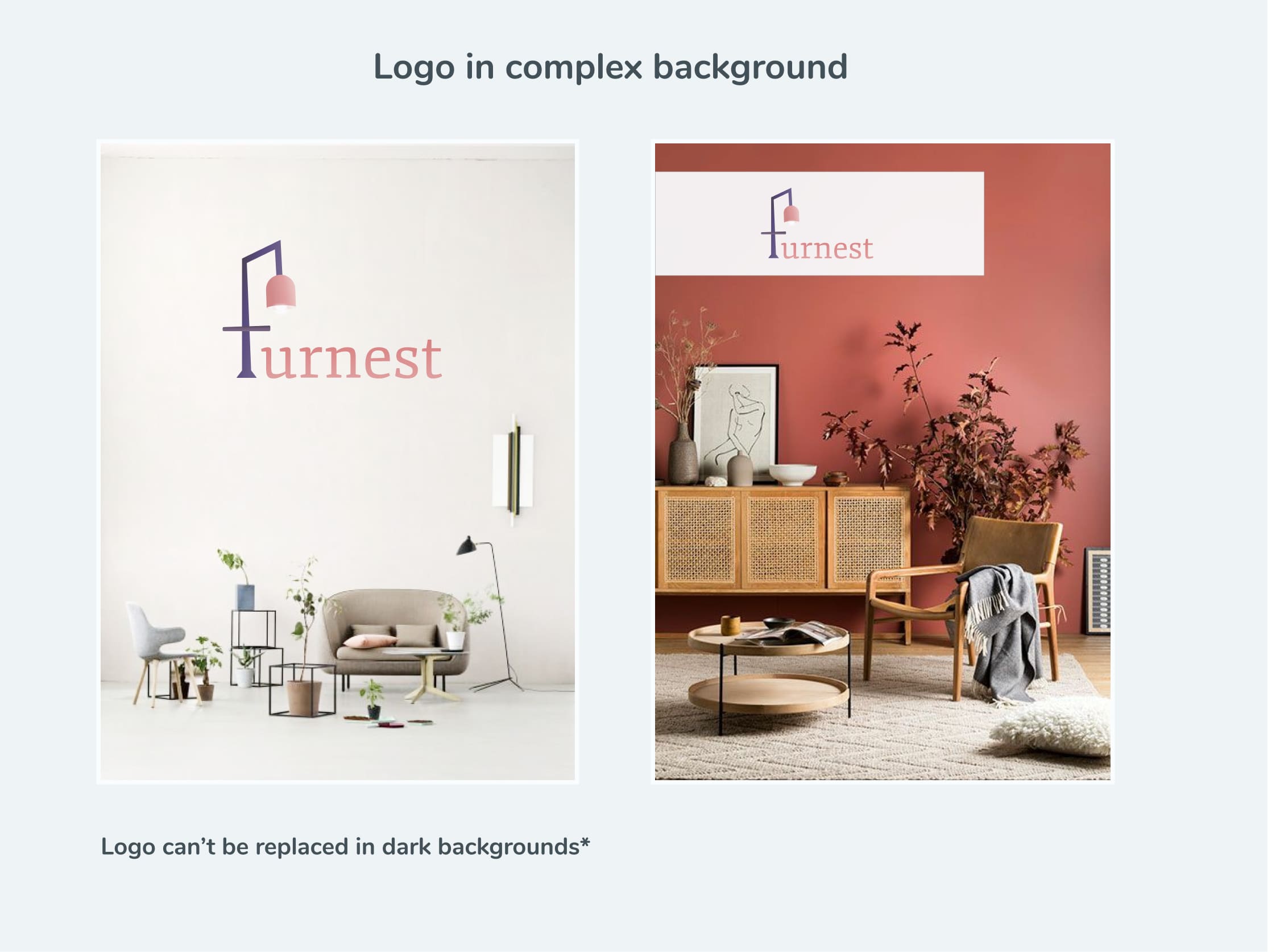
Branding
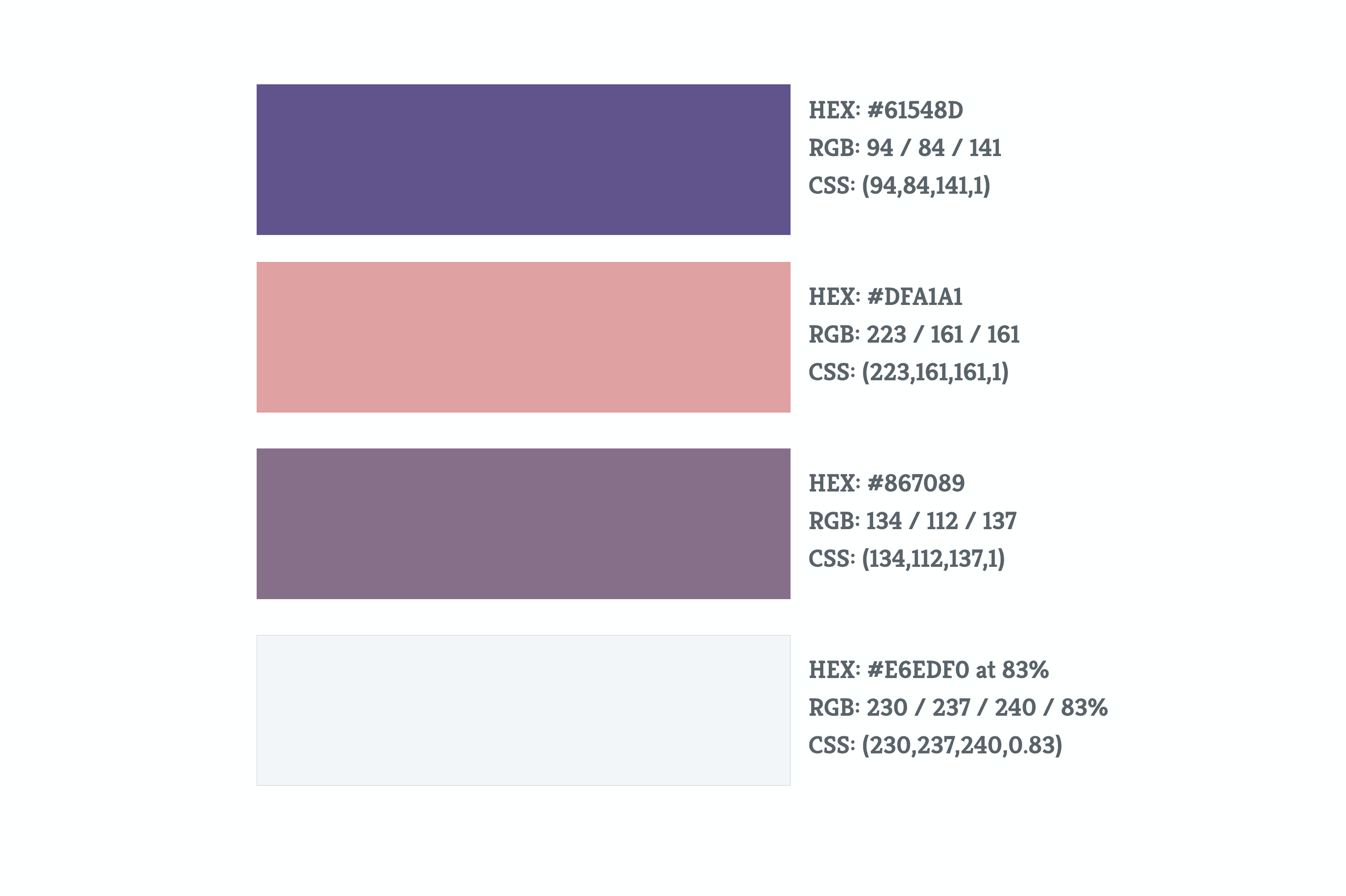
Colour Palette
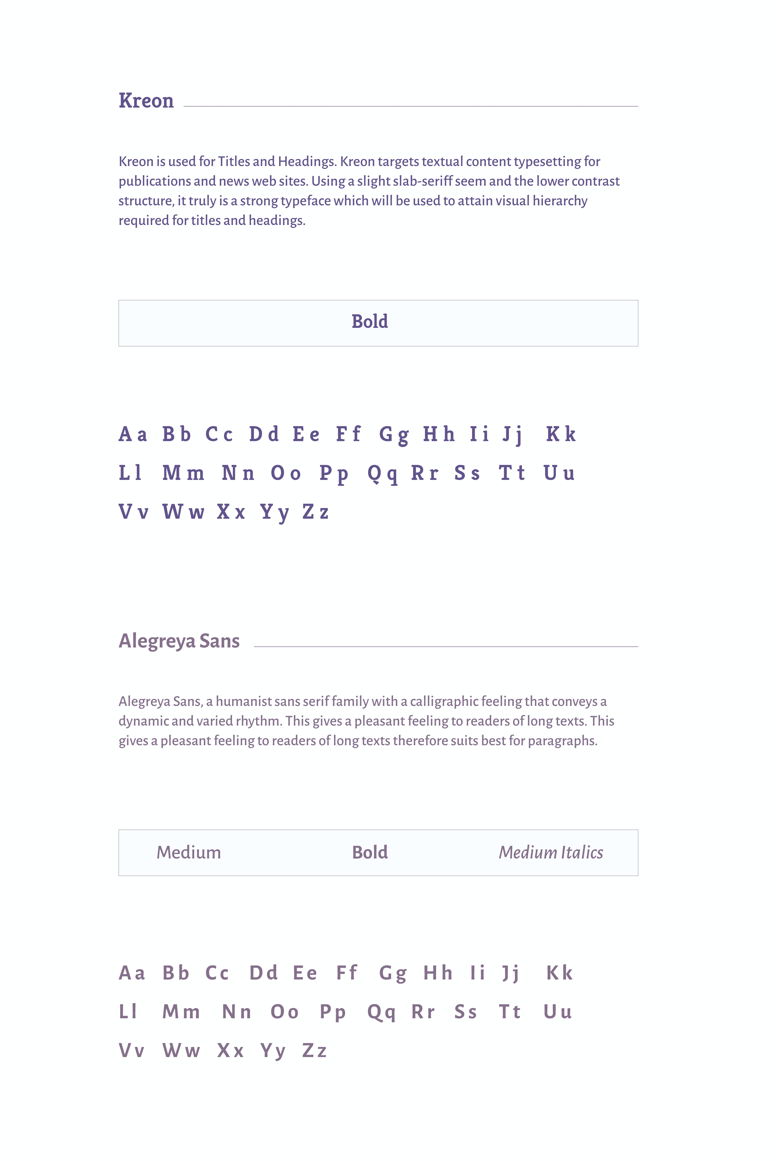
Typography
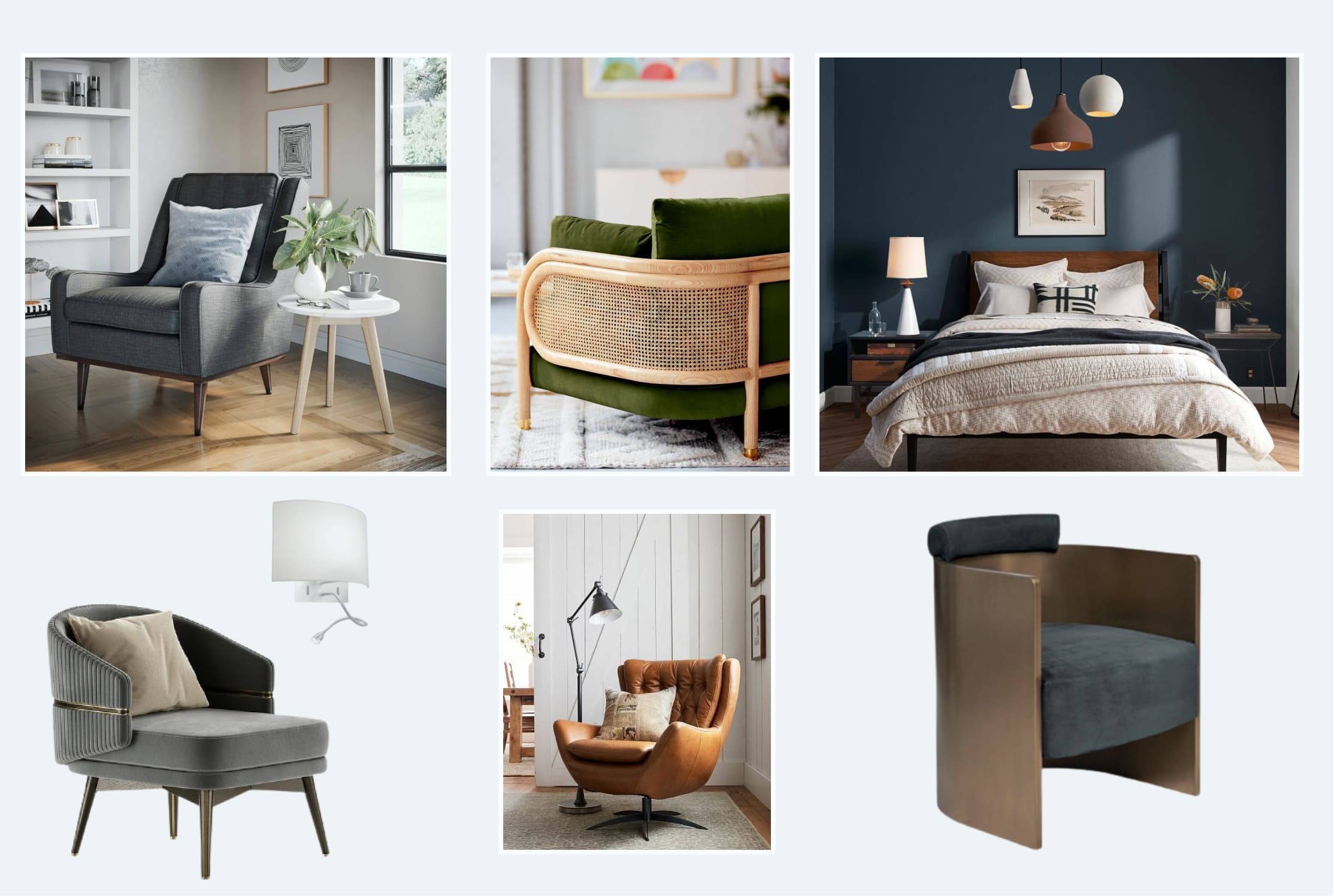
Imageries
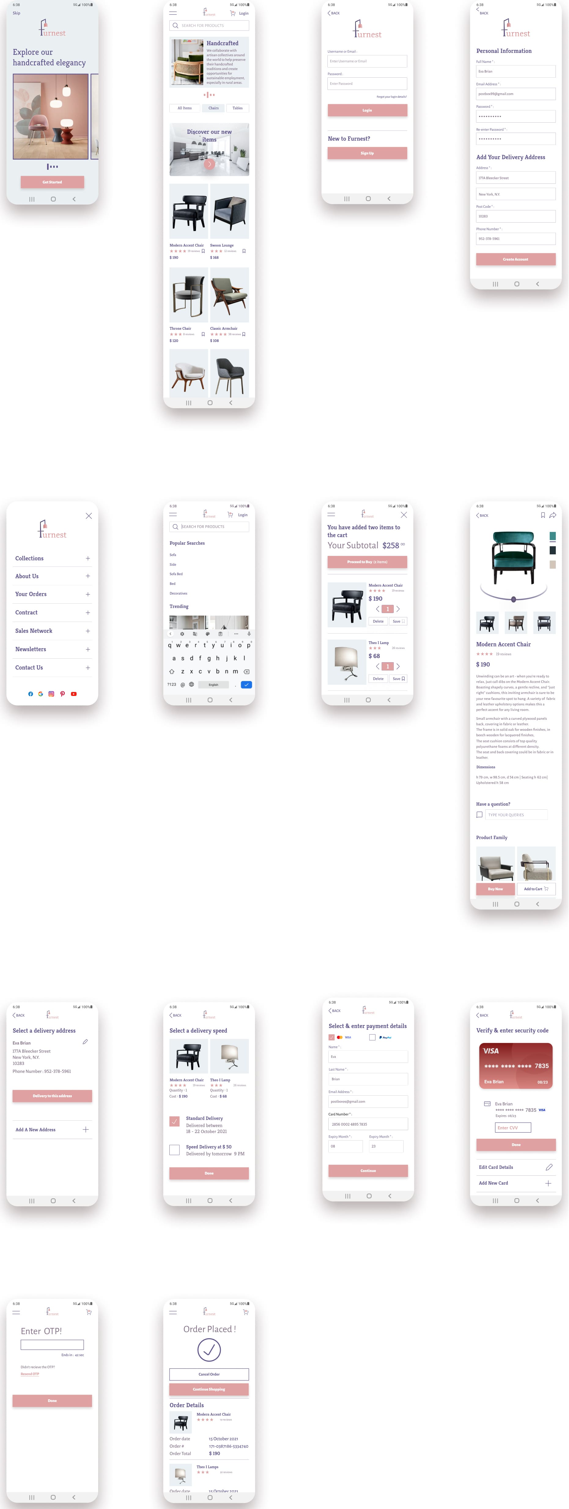
High-Fidelity Wireframes
(Pre-Feedback)
User Feedback 1: Alric
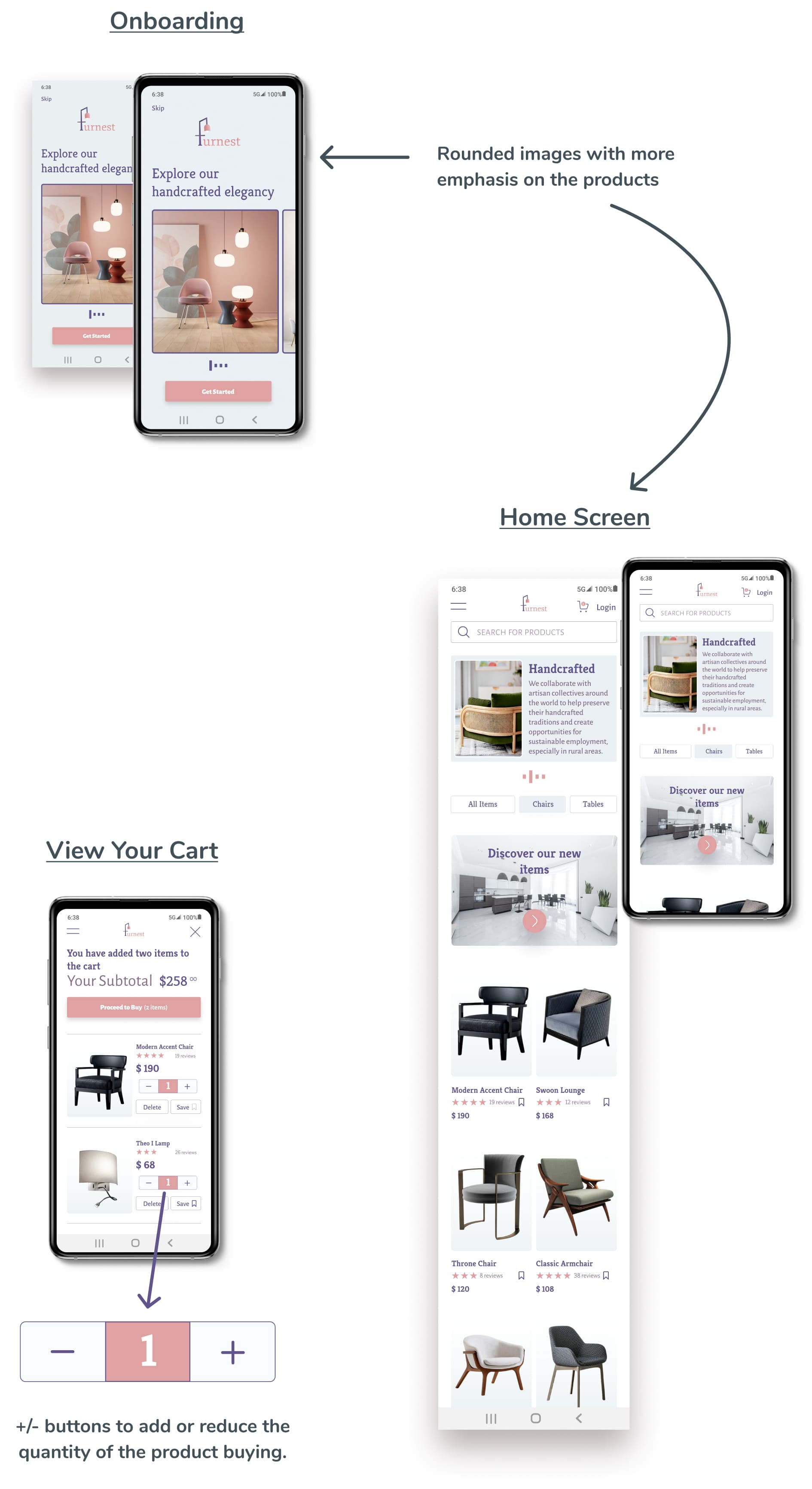
It looks too boxy. Images look very basic because of which aesthetic feel is missing.
User Feedback 2: Ashwin
The flow is fine but it would be nice if you could add a home icon so that I could easily navigate back to the Home page instead of clicking back icon multiple times.
User Feedback 3: Natasha
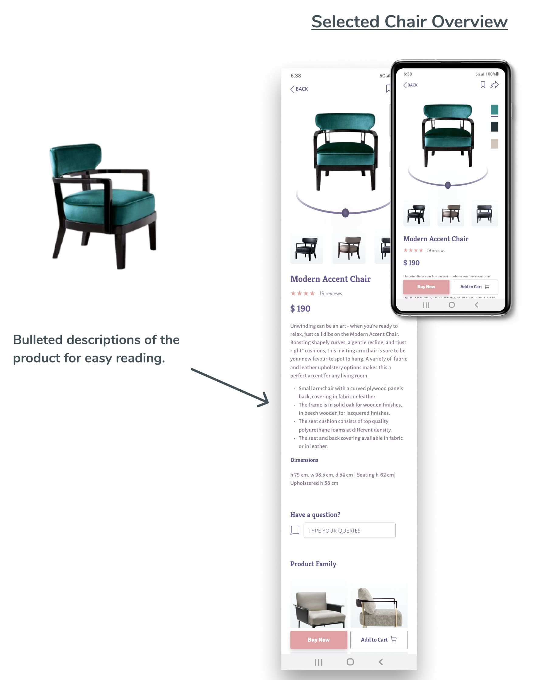
It would be better and easier to read if you could change the description of the chair from paragraphs to just bullet points.
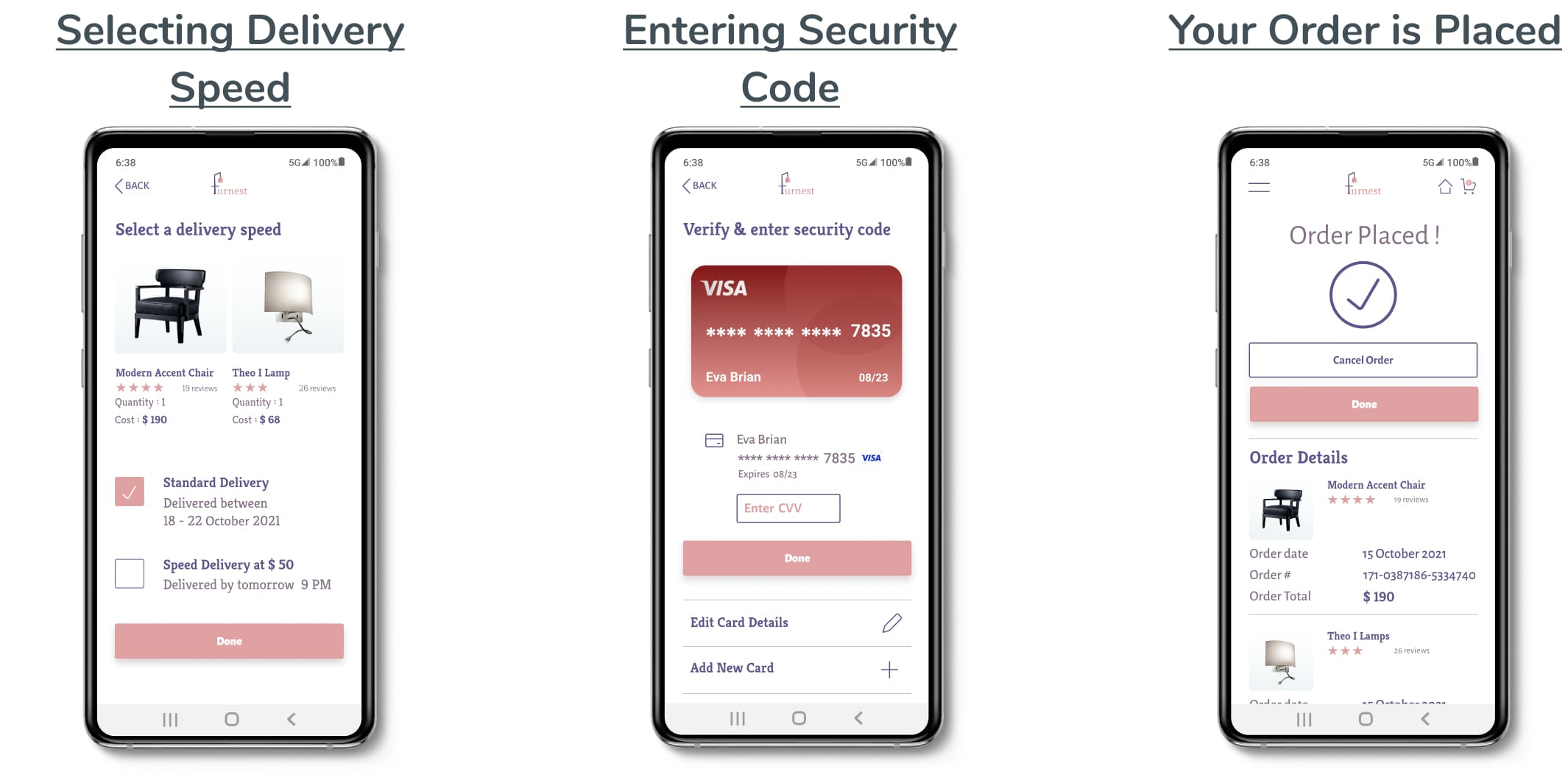
The flow and navigation is smooth and is quite logical.
User Feedback 4: Bala Karthikeyan
The flow is good but my only concern is in the cart section where I feel for quantity it would be easier and user friendly to add +/- button instead of arrows.
High-Fidelity Wireframes
(Post-Feedback)
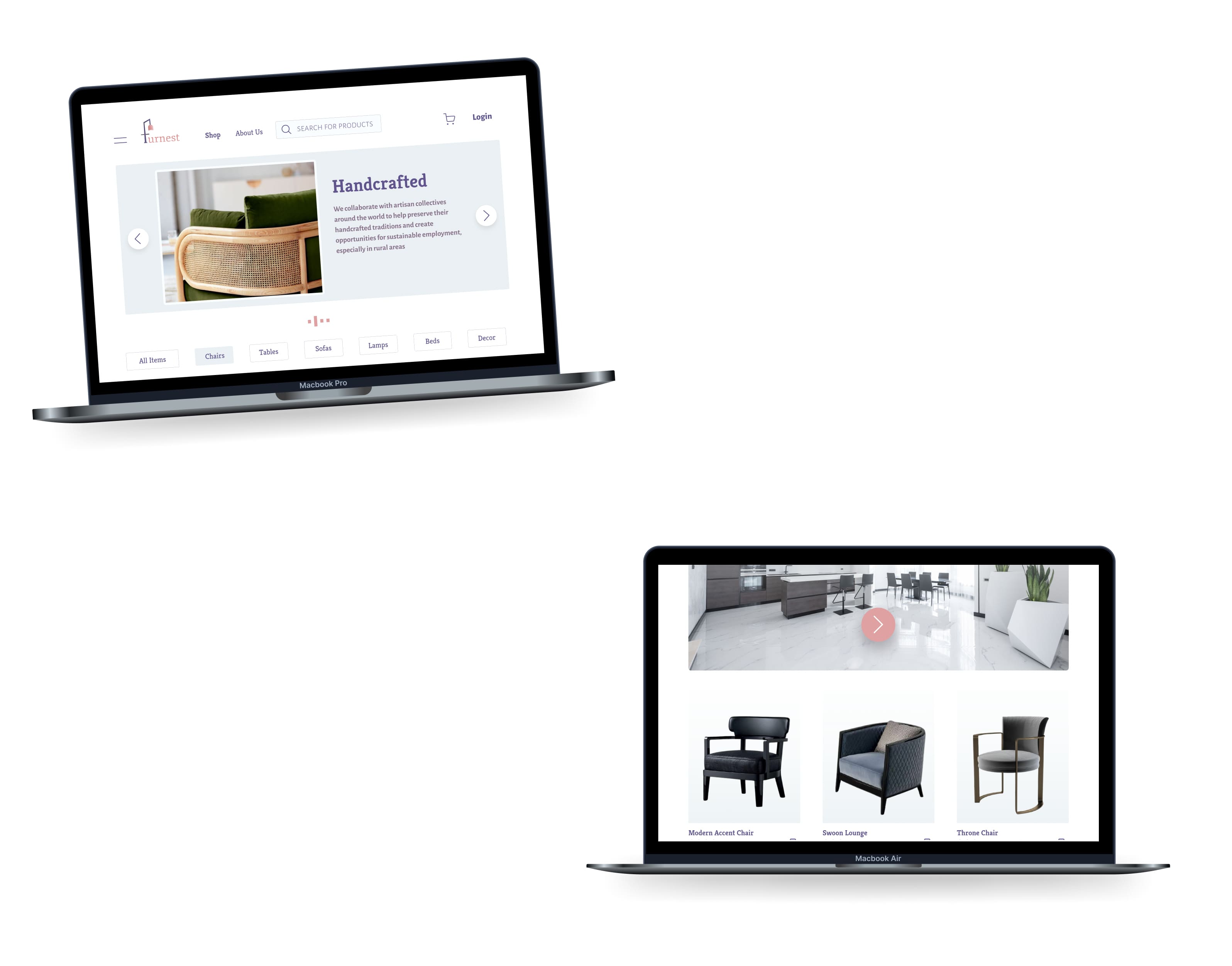
Responsive Designs
Retrospective
What went well?
For me, establishing a brand, designing a logo and developing the rules around logo usage was the most immersive part of this project. Creating interactions and animations sparked my interest in learning more about it.
What didn’t go well?
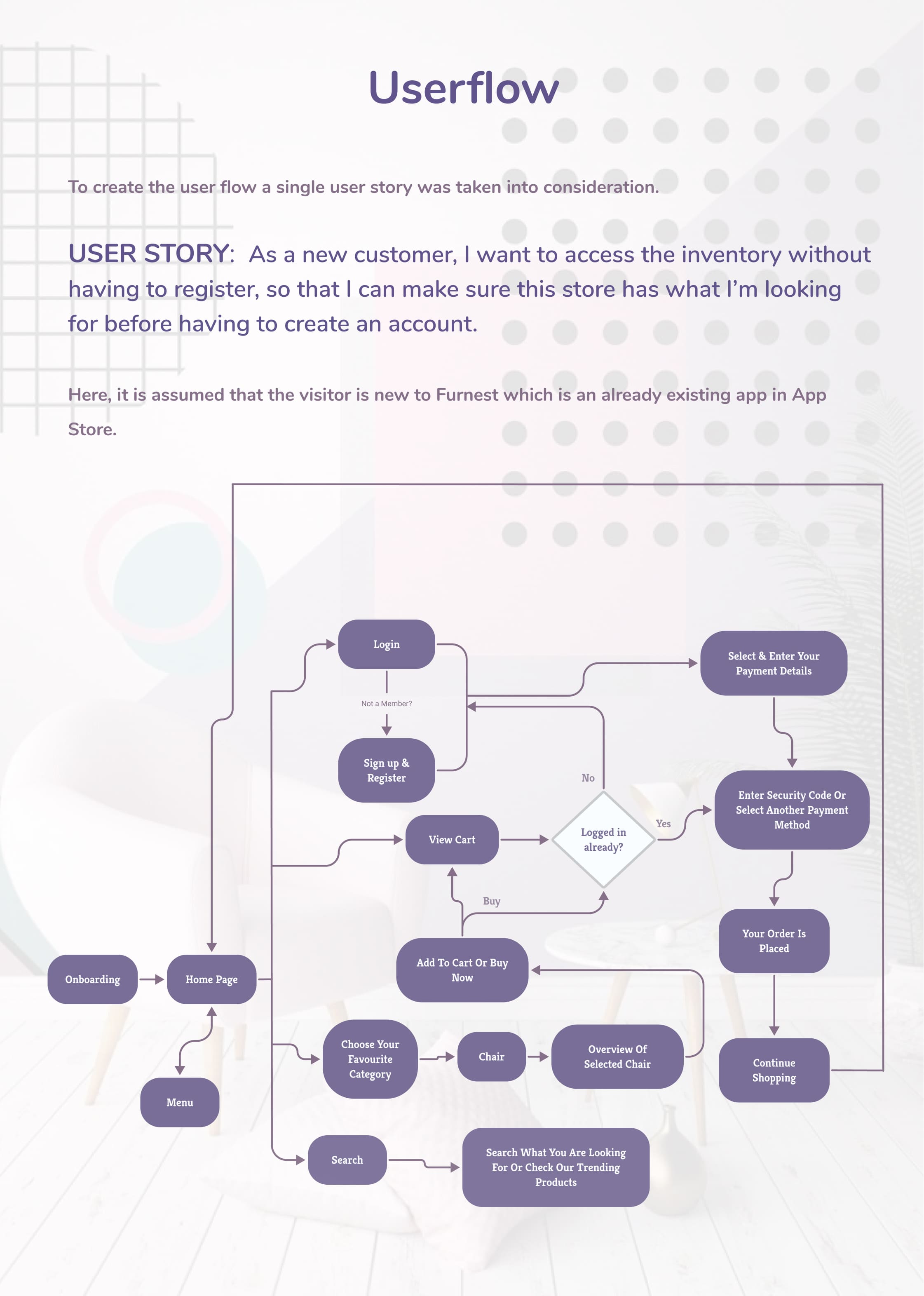
Creating proper user flows to ensure a great and smooth online shopping experience was the most challenging task for me.
What can be improved?
I tried keeping this online shopping brand more elegant, formal and business-like. What I would like to improve next time is while sticking to the above characteristics I would like to come up with more friendly and welcoming designs.

